
 Tutorials


 Ahura
Ahura Plugins

 Blog
BlogWhat’s the Difference Between UI and UX? A Complete Guide to Interface and Experience Design
- Tutorials
- Updated on
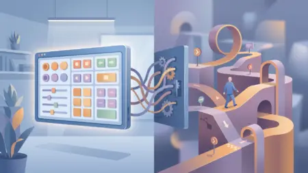
Picture two websites selling the exact same thing. You open the first one and — you don’t even know why — you just feel good; you move around easily, what you want shows up fast, you make your purchase and leave. You open the other one and close it two minutes later, frustrated. Same product, same price, so where’s the difference?
The difference is exactly what people have named UI and UX. You’ve probably heard these two terms in every discussion about web design and apps — so often that they sometimes get used interchangeably. But the truth is they’re two completely separate things. Put simply: UX is the feeling you get while working with a product — was it easy? did you get confused? did you get your task done? UI is what’s in front of your eyes and what you interact with — colors, buttons, fonts, layout.
In this article I want to make clear, without overcomplicating it, exactly how these two differ, where they tie together, and — if you want to get into this field yourself — where to start. Let’s dig in.
Table of Contents
UI vs. UX at a Glance
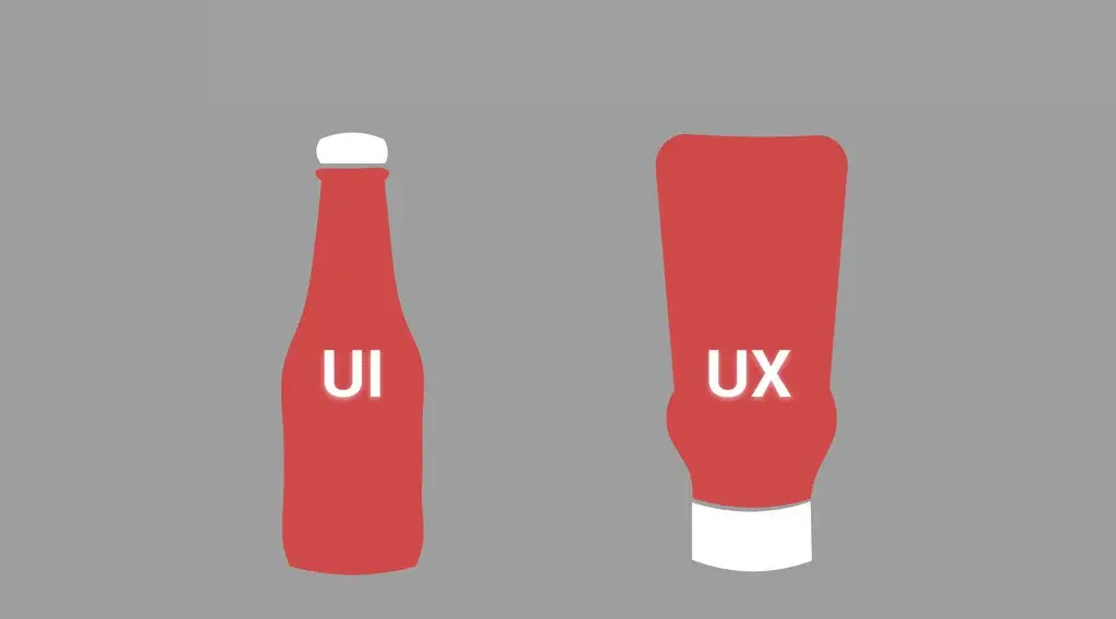
Before we get into the details, let me sum the whole thing up in a table. If you read only this and close the rest of the article, you’ll still have the core difference:
| Criterion | UX (User Experience) | UI (User Interface) |
|---|---|---|
| What does it build? | The overall feel of using the product | The look — what you see and touch |
| What’s its question? | “Did the user get their task done?” | “Is it pleasant and good-looking?” |
| What does it produce? | Journey maps, wireframes, structure | Color, font, icons, buttons, final layout |
| How do you notice it? | Usually subconsciously; you only realize when it’s bad | Right away, at a glance |
| Common tools | User research, testing, journey diagrams | Figma and work on visual details |
The takeaway from this table: UX is the skeleton and logic of the work; UI is its skin and appearance. A site can be gorgeous but agonizing to use (good UI, bad UX), or the reverse — it gets your task done but has no charm. What actually keeps a user around is where these two work well together, which we’ll get to.
What Is UX?
UX is short for User Experience. The simplest definition: any feeling a user gets while working with your product is UX. Note that this isn’t just about websites and apps; anywhere a person deals with a product, an experience takes shape. Even when a can of food is hard to open and you get annoyed, that’s bad UX too.
But let me put it more concretely. Say you have an online course site. A user comes to buy a course. Now follow their path: Did they register easily? Did they quickly find the course they wanted? Did they hit no snags at checkout? After buying, did they figure out where to start? If all of this was smooth, your site’s UX is doing its job — even if the user has never heard the term “UX.”
Here’s the interesting part: UX usually goes unseen. When things just work, the user doesn’t think about it at all. It’s only when they get stuck somewhere, can’t find a button, or fill out a form three times and keep getting an error, that they realize something’s off. That’s why people say a good UX designer is someone whose work you don’t notice.
Let me share a small experience that illustrates this well. I saw a site whose signup form had eight fields — first name, last name, ID number, phone, email, and a few others. When they removed the unnecessary fields and left only phone and password, the signup completion rate rose noticeably. Nothing was added to the site’s appearance; the user’s path just got shorter. That’s UX.
What Is UI?
So far we’ve said UX is that overall feeling. Now let’s get to UI — User Interface. If UX tells you whether the user’s path is logical, UI is what the user sees in front of them and interacts with: the colors, buttons, fonts, spacing, icons, and the whole look and mood of the product.
Let me use an example so the difference from UX fully lands. Imagine you’re shown two bookselling sites. Both have identical books, and the prices are a perfect match. The first uses clean, high-quality images of the books, its color scheme is easy on the eyes, its buy button is clearly where you’d expect, and it’s simply a pleasure to look at. The second has everything too, but it’s dry and lifeless, as if no one cared about its appearance.
Here’s the point: both sites might be identical in path and function (that is, UX). On both, you can find and buy the book just as easily. But that first site has something extra that keeps the user around and builds a sense of trust. That “something extra” is strong UI.
So we’ve realized UI is your product’s clothing. In those first few seconds, the user subconsciously judges — from the appearance alone — whether they’re dealing with professional work or not. That’s why even the best ideas, if they have weak UI, stand less chance of being noticed.
How Do UI and UX Work Together?
Up to now we’ve defined UI and UX separately, but the reality is that in the real world these two don’t come apart. They’re not each other’s rivals, and one doesn’t replace the other. They’re like two people working on a shared project; if they’re not in sync, the result falls apart.
The best metaphor I know is a house. UX is the floor plan: where the rooms are, whether the kitchen is close to the living room, whether the paths through the space make sense. UI is the wall color, the furniture style, the lighting. Now picture a house with the most expensive furniture and the most beautiful colors, but the bathroom is in the middle of the kitchen and to reach the bedroom you have to pass through the shower. However pretty it is, living in it is torture. That’s good UI, broken UX.
The reverse exists too. A house whose plan is flawless, but the walls are bare and lifeless and give you no feeling at all. You’re comfortable in it, but you don’t want to stay. That’s good UX, weak UI. What actually works is where the right plan and a pleasing look come together — that’s when the user both gets their task done and feels good and comes back.
That’s why people say UI on top of bad UX is like makeup over a wound; it looks nice from a distance, but the problem is still there. The order of work usually goes like this too: first UX lays out the path and structure, then UI comes in and turns that skeleton into something that’s both beautiful and likable.
What’s Changed About UI and UX in 2026?
If you’d read this article a few years ago, the UI and UX discussion would have been mostly about color, layout, and the user’s path. But now there’s a new player on the field that has shaken everything up: artificial intelligence. Interestingly, contrary to the fear many people had, AI hasn’t taken the designer’s place — it’s become more of a collaborator. According to a 2026 designer survey, about 73% of designers say AI’s most important impact in 2026 is its role as a design collaborator, and 93% already use generative tools in their work. In other words, the new skill today’s designer needs is knowing how to work with these tools, not fearing them.
But the subtler point is where AI sits in the interface. The 2026 trend is that AI shouldn’t take all the control and make decisions on the user’s behalf. Instead of an all-knowing autopilot, AI is finding the role of a respectful, optional collaborator that appears in side panels and collapsible layers; it’s there if you want it, but it doesn’t get in the way of your work. This is an important shift in UI and UX design: giving power to the user, not taking it away.
The other big trend is the swing from clutter to simplicity. For a few years, interfaces had drifted toward eye-catching effects and flashy flourishes, but now the tide has turned. The 2026 focus is on reducing the user’s cognitive load and calmer interfaces; gamification and exaggerated animations are giving way to gentle, purposeful micro-interactions. The message for you is simple: you don’t need to confuse the user in order to be “special.” A few extra clicks send people running, just like that. A clean design where the user doesn’t get lost is worth more today than any pretty effect.
So the change isn’t that the definition of UI and UX has shifted — that’s stayed the same. What’s changed is the expectation: the 2026 user wants simplicity and wants to feel in control. Good design is the kind that gives them both.
Which Should I Learn? UI or UX?
This is maybe the most frequently asked question from newcomers. Short answer: it depends on you. But let me help you figure out which one is closer to your nature.
If you’re the kind of person who likes to understand why people do what they do, has the patience to talk to users and analyze their behavior, and enjoys solving puzzles and laying out logic, UX will probably suit you. A UX designer’s work is mostly about research, testing, drawing the user journey, and wireframing. The main tool here is your mind, not software.
If, on the other hand, your eye is on visual details, color and font and layout put you in a good mood, and you like what you build to be beautiful too, UI is yours. Here you’ll spend more of your time with tools like Figma, working on the final appearance.
Now a blunt reality: in the job market — especially at small and medium companies — they usually expect one person to know both UI and UX, which is exactly what you see under the title “UI/UX Designer.” So if you’re just getting started, my suggestion is to start with the fundamentals of both, then gradually go deeper into whichever one clicks with you more. You don’t need to pick one from day one.
Let me also share the last point, which I wish someone had told me sooner: learn the tools late, the principles early. Many people latch onto learning Figma from the start and think that’s the whole thing. But Figma is just a pen; what makes a good designer is an understanding of people and the logic of design. You’ll learn the tool in a month; this other thing takes years.
Frequently Asked Questions About UI and UX
Can one person do both UI and UX?
Yes, and it’s very common. At small and medium companies, one person usually does both and is known by the title “UI/UX Designer.” On larger teams these two typically get separated, since each demands its own specialization and focus.
Which one is harder?
Neither is inherently harder than the other; they’re just different in nature. UX is more mental and analytical and deals with people and their behavior; UI is more visual and detail-oriented. How hard each one is comes down to which one you naturally get along with.
To get started, which should I learn first?
If you’re not forced to choose, start with the fundamentals of both. But many people start with UI because they see its results sooner and more visually, which isn’t bad for motivation. More important than the order is that you learn the principles of design, not just the tool.
Which one pays more?
This depends more on your skill level and experience than on whether you do UI or UX. Designers who know both well and can carry a project from research through to final design usually have a better position in the market.
Do I have to know how to code to learn this?
No, you don’t need to be a programmer. But a general familiarity with how sites and apps work behind the scenes helps you produce designs that are actually buildable, so you don’t run into problems when handing off to the technical team.
Wrapping Up
If I had to sum up this whole article in one sentence, it’s this: UX is about how your product works, UI is about what it looks like. The first is the feeling the user takes away, the second is what they see. Neither is complete without the other — a gorgeous site you get lost in drives users away just as much as a functional but lifeless one.
The point I hope stays with you is that you shouldn’t see these two as rivals. The best products are the ones that have both the right plan (UX) and a pleasing look (UI). Whether you’re a designer yourself or the owner of an online business, if you ask yourself with every decision “does this get the user’s task done?” and “does it make them feel good?”, you’re effectively thinking about both.
If you’re looking for a shortcut to having a site that respects both of these from the very start, you don’t have to build everything from scratch. When we designed the Ahura theme, we set exactly these two things — the user’s experience and feeling — as our main criteria; we tried to put each element right where the user expects it, not where it merely looks special and disrupts the user’s routine. At the same time, we left your hands free to move and restyle any section, because in the end this is your site. If you’d like to see it up close, click the button below.

Ahura WordPress Theme
The Power to Change EverythingElementor Page Builder
The most powerful WordPress page builder with 100+ exclusive custom elements.
Incredible Performance
With Ahura’s smart modular loading technology, files load only when they are truly needed.
SEO Optimized for Google
Every line of code is carefully aligned with Google’s algorithms and best practices.
To post a comment, please register or log in first.