
 Tutorials


 Ahura
Ahura Plugins

 Blog
BlogEmail Marketing Ideas to Increase Your Website Sales
- Tutorials
- Updated on
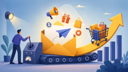
If you’re like a lot of site owners who stuck a simple “Subscribe to our newsletter” form in the corner of your sidebar and have spent months waiting for your email list to fill up, you’ve probably realized by now that this approach just doesn’t work anymore. Users don’t even see that form, let alone enter their email into it.
But here’s the good news: growing your email list quickly isn’t some unreachable dream, and it doesn’t require a miracle either. Today, as tools have gotten more advanced and user behavior has shifted, new and tested techniques have emerged that can multiply your number of subscribers in a short span of time. The whole trick is simply knowing these methods and executing them properly.
In this article, we’re going to walk through 17 practical, up-to-date, and useful strategies for rapidly growing your email marketing list — methods that not only work in 2026 but, if you implement them right, can put you a step ahead of your competitors. But before we get to the methods themselves, we need to take care of one important thing: locking down your infrastructure. Because without the right foundation, none of these 17 methods will deliver the results they should. So let’s start right there.
Table of Contents
Before You Begin: Lock Down Your Infrastructure
Picture this: you put in a ton of effort and, using the very methods we’re about to cover, you collect thousands of emails — but then you find out that your emails either aren’t being delivered at all or are landing straight in your users’ spam folders. That means all your effort has gone to waste. This is exactly why, before doing anything else, you need to shore up the two main pillars of your infrastructure: a reputable email marketing service, and a professional tool for building forms. Let’s look at each one separately.
Choosing a Reputable Email Marketing Service
The most important thing you need is a professional email marketing service, and choosing it really carries a lot of weight. A few years ago, using free or unknown services might have gotten the job done, but the story is different today. Google and email providers like Gmail and Yahoo have very strict algorithms for detecting spam. If you use an unreliable service, there’s a serious chance your emails will automatically get dumped into users’ spam folders and end up being of no use at all.
Strong, reputable options like Mailchimp, ConvertKit, ActiveCampaign, MailerLite, and Klaviyo (which is geared toward e-commerce stores) are still among the best. When choosing, keep an eye on three key capabilities: automation (for sending emails automatically), audience segmentation (for sending the right message to the right person), and detailed reporting (so you can figure out what’s working). It’s worth doing your own research to compare the top email marketing services in depth, since that will help you make a better choice.
Choosing a Form and Pop-Up Builder Tool
The second pillar of your infrastructure is a practical tool for building and displaying attractive forms. In this space, we recommend OptinMonster, which is one of the most powerful options, but there are other excellent choices too — like Thrive Leads, ConvertPlug, and even the pro version of Elementor — that will get the job done for you.
These tools let you design professional forms, smart pop-ups, and targeted campaigns without any programming knowledge. Since pop-ups are one of the most frequently used tools in the methods that follow, it’s a good idea to first get familiar with the principles of building them properly — how to create a pop-up that’s effective but doesn’t annoy the user or hurt your SEO. It’s worth reading up on pop-up advertising fundamentals before you continue.
Now that your infrastructure is ready, let’s get to the heart of the matter: 17 golden methods that can multiply your email list in the shortest possible time.
Why Isn’t a Simple Sidebar Form Enough Anymore? (The Banner Blindness Phenomenon)
You might be wondering why we keep emphasizing “not being simple.” What’s wrong with that same subscription form in the sidebar? The answer lies in an interesting psychological phenomenon called “Banner Blindness.”
Banner blindness means that, over time, our brains have learned to unconsciously ignore repetitive advertising elements. Over the years, users have encountered so many banners and corner-of-the-page subscription forms that their eyes basically don’t see them anymore. It’s just like when you walk past dozens of billboards on a busy street without a single one of them sticking in your mind. The static, ever-present sidebar form has met exactly the same fate: the user categorizes it as “just another permanent ad” and skips right past it.
So what’s the solution? The solution isn’t to remove the form entirely, but to use smarter and more varied methods. Instead of waiting for the user to find the form on their own, we need to put our offer in front of them at the right moment and in the right way — for example, when they’re about to leave the page, when they’ve read an article all the way to the end, or when we surprise them with a genuinely valuable offer.
There’s an important point we should mention right here: variety and intelligence are the key, but overdoing it is a deadly poison too. If you bombard the user with dozens of forms and pop-ups, not only will you not collect more emails, but you’ll ruin the user experience and drive the user away. The real art here is maintaining balance.
17 Email Marketing Methods
Now that you understand this principle, let’s look at 17 practical methods, each of which maintains this balance in a different way and captures the user at just the right moment.
Using Multiple, Smart Signup Forms
As we mentioned in the previous section, settling for a single form in the sidebar just doesn’t cut it anymore. You need to use every opportunity you have to turn a user into an email subscriber before they leave your site. The logic is simple: the more touchpoints you have with a user, the higher your chances of winning them over.
So instead of one form, spread your forms across different spots on your site: inside the content itself, at the end of the post, in the header, in the footer, and even as a sticky bar at the top of the page. Each of these spots is a fresh opportunity to grab the user’s attention. Just one important warning: be careful not to overdo it. The goal is to have a presence, not to suffocate the user with forms. Always maintain the balance between “being seen” and “not being a nuisance.”
Use an Exit-Intent Pop-Up (Still Powerful)
One of the most practical technologies, popularized by tools like OptinMonster, is Exit-Intent — literally “detecting the intent to leave.” By tracking the user’s mouse movement, this technology shows them a targeted pop-up at the exact moment they’re about to close the tab or leave the site.
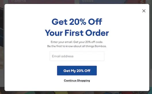
You might think pop-ups are old news by now, but the stats prove otherwise. According to up-to-date data, exit pop-ups convert around 4 percent of departing users into subscribers on average — meaning users you’d otherwise lose forever. The reason for this success is clear: because the pop-up appears at the very last moment and without interrupting the reading of the content, it grabs the user’s attention precisely when they have nothing to lose.
The secret to this method’s success lies in the offer you make. Put an attractive offer inside the pop-up (like a discount, a free downloadable file, or access to exclusive content). Also, make sure to design this window to be simple, with an easy close button, and with friendly copy that conveys a good feeling to the user.
Offer Irresistible Content (A Strong Lead Magnet)
Now we come to one of the most important and fundamental methods — one that is, in fact, the driving engine behind many of the other methods too. The idea of a lead magnet is simple: in exchange for the user subscribing to your email list, you give them an instant, valuable reward.
This reward can be anything: a free e-book, a practical checklist, an exclusive tutorial video, a ready-made template, or even early access to a product. For example, if you run an educational site, you could let your subscribers download the course’s practice files. If you have a blog, you could give them a condensed PDF version of your best content.
But here’s the crucial key point: this reward has to be valuable enough that the user enters their email without a moment’s hesitation. Nobody’s willing to hand over their email for a worthless, slapped-together file. So instead of making dozens of weak lead magnets, take the time to design one or two genuinely great and useful offers. The quality of this reward directly affects your conversion rate.
Build Dedicated Landing Pages for Your Lead Magnet
Now that you’ve built a great lead magnet, you need the right place to present it. This is where dedicated landing pages come in. The logic here is simple: when a user lands on a page to grab your offer, nothing else should distract them.
For this reason, a lead magnet landing page shouldn’t have a top menu, a sidebar, a cluttered footer, or exit links. This page should only include a few elements: an attractive headline, a short explanation of the offer’s benefits, an introductory image or video, and finally the signup form. That’s it. The simpler and more focused the page is, the more likely the user is to enter their email.
The good news is that you don’t need any programming at all to build these pages. With page builders like Elementor or SeedProd, you can put together a professional landing page in under an hour. These pages not only grow your email list quickly, but if you also have incoming traffic from Google Ads or social media, they make a fantastic destination for that traffic.
Set Up Gated Content
Another clever method is using gated content. With this approach, a user can only see part or all of a piece of content once they’ve entered their email. This method works especially well for specialized articles, research reports, or online tools.
Let’s clarify with an example. Suppose you’ve built an online calculator for business expenses. The user can fill in all the inputs, but to see the final result they have to give their email. Or, say, you show the first half of a tutorial article and put the second half (which is the most compelling part) behind a subscription form.
You might be worried about SEO, but rest easy: Google detects content locked with JavaScript just fine and won’t penalize you — on one important condition, that your main, valuable content is also accessible without a lock. In other words, don’t lock everything. To implement this feature, you can use those same plugins like OptinMonster or Thrive Leads.
Create a Competitive Space (a Contest or Giveaway)
Humans are inherently drawn to competition and the chance to win, and you can use this very trait to grow your list quickly. Running an attractive contest or giveaway is one of the fastest ways to bring in thousands of new subscribers and followers without much hassle.
The secret to this method’s success comes down to two things. First, simplicity of the entry process: the user should be able to enter the giveaway just by submitting their email (and maybe following your social pages); the more complicated the path, the fewer people participate. Second, a valuable and relevant prize: the prize needs to be both tempting and connected to your business. For example, if you run a digital gadget store, a high-end pair of headphones makes a good prize (because it attracts people interested in your field), but giving away something unrelated — like a gold coin — only attracts irrelevant people who will never become your customers.
To run these contests, you can use plugins like RafflePress or KingSumo, which simplify the whole process for you. This method remains one of the highest-yield ways to grow an email list in 2026.
Offer an Instant Discount to Your Potential Users
Discounts are one of those factors that always work, everywhere in the world. Users are prompted to jump on them without hesitation — but on two important conditions: the discount has to be real, and it has to have a limited time window. A permanent, never-ending discount no longer creates a sense of urgency and won’t push the user to take action.
If you set up your online store with a standard e-commerce platform, the good news is that you can very easily define a set of automatic discount codes for new subscribers right through the platform’s settings. Most modern e-commerce solutions have built-in tools or add-ons that walk you through creating these codes.
But here’s the key point: only show this discount code to a user once they’ve entered their email. For example, put up a message like: “10% off your first purchase, just for subscribing to the newsletter.” This way, the discount turns into a “win-win deal” — the user gets their discount and you get your email. This method works wonders especially for newly launched stores looking to gather customers quickly.
Don’t Underestimate the “Contact Us” Form
One of the opportunities most sites overlook is the “Contact Us” form. But not a plain, lifeless form — a professional contact form that also includes an option like “I’d like to be notified about your discounts and newsletter.”
Look at the logic: someone who takes the trouble to reach out and contact you clearly has a real interest in your product or service. This is the best possible opportunity to win them over, because the user is already warm and interested. It’d be a shame to let this chance slip away.
There are some good plugins for this. One of the best and most powerful is WPForms, which smartly adds a newsletter subscription option to your forms. Of course, you can use other plugins like Contact Form 7 or Formidable Forms too. But don’t forget one very important legal point: be sure to leave that subscription checkbox unchecked by default, so the user consciously opts in themselves. This both complies with anti-spam laws and ensures that only people who genuinely want to will join your list.
Use End-of-Post and In-Line Forms
This method has one of the most reliable conversion rates, and the reason is clear: it’s displayed at the exact moment of the user’s maximum engagement. When a user reads an article all the way to the end, it means they trust your content and value it. So this is the best moment to present a subscription offer.
There are two great spots for these forms. The first is the after-post form, right where the user has finished the piece — an offer related to that same topic can be very effective. The second is in-line forms, which are placed between the article’s paragraphs. For example, after the third paragraph, write a line like: “To download the PDF version of this article, enter your email,” and show the form.
The subtle point of this method is that the form should be relevant to the content of that same page. A generic offer like “subscribe to the newsletter” has little effect, but a relevant offer like “download the complete checklist for this very tutorial” is exactly what an interested user needs. Despite being simple, these techniques are still among the most effective methods.
Use a Slide-In Box
As we discussed at the start of the article regarding banner blindness, the static, ever-present sidebar forms have a very low conversion rate today because users have gotten used to them and ignore them. But a slide-in box can solve this problem.
A slide-in box is a small box that gently emerges from the corner of the screen with a soft animation. Its main difference from a sidebar form lies in that very “movement” — the human eye naturally reacts to motion, so this box grabs the user’s attention, but because it appears slowly and from the corner, it isn’t intrusive and annoying like a full-screen pop-up. This balance between “grabbing attention” and “not being a nuisance” is exactly what makes the slide-in box so practical.
To get the best results, you can set this box to appear at the right moment — for example, after the user has been present for 10 seconds, or once they’ve scrolled through 50 percent of the page (which is a sign of their interest in the content). Tools like OptinMonster and Thrive Leads make this capability very easy to access.
Make the Most of Your Site Header
The site header is one of the most important components of any website, because it’s the first thing that grabs the user’s attention the moment they arrive. It’d be a shame not to use this prime real estate for growing your email list.
Many modern themes have a top bar or an advanced header where you can fit a simple subscription button or form. For example, a colorful, eye-catching button in the corner of the header reading “Subscribe and Get a Discount” can be very effective. The advantage of the header is that it’s seen on every page of the site, so it multiplies your chances of capturing subscribers.
To use this capability, you need a theme that supports custom headers and drag-and-drop elements. Page builders like Elementor or Beaver Builder give you this ability, and the good news is that both have solid free versions — so you can build a professional header with an email form without paying a cent.
Add a Social Login Signup Button
You’ve surely seen the “Sign up with Google” or “Log in with Facebook” button on plenty of sites. This button lets a user join your list with just one click, without filling out any form, using their Google or Facebook account.
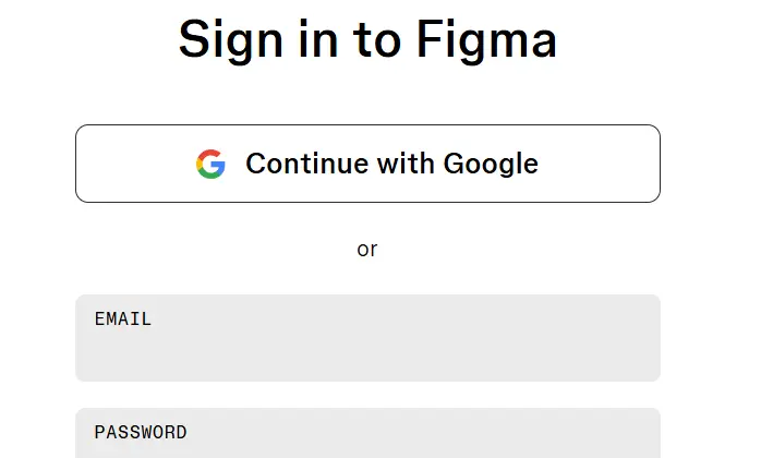
The secret to this method’s power lies in removing friction. The reality is that users are lazy, and even filling out a simple email field counts as a small obstacle that might cause them to bail. But when it’s all done with a single click on the familiar Google or Facebook button, that obstacle disappears and the signup rate goes up. On WordPress, you can place these buttons next to your subscription form with plugins like Nextend Social Login.
Just keep one thing in mind: in exchange for this convenience, you might not obtain complete information about the user. But to start an email relationship, simply having their email is perfectly enough, and you can gather the rest of the information gradually over time.
Use LinkedIn and Twitter Lead Cards (Especially for B2B)
If your business deals with professional and corporate (B2B) audiences, this method can be golden. Platforms like LinkedIn and Twitter (X) have a feature called Lead Generation Cards that lets you run a lead capture form directly within the platform itself.
The biggest advantage of this method is that the user doesn’t have to leave the platform and come to your site at all. The form is already pre-filled with the user’s own profile information, and they hand over their email with just one click. This complete removal of friction gives you a high conversion rate — and from a professional audience that’s extremely valuable for B2B businesses.
To make this method work even better, you can set up some exclusive benefits for users who join through this channel — for example, an invitation to a free webinar or access to a specialized industry report. These professional offers are exactly what a B2B audience is drawn to.
Use YouTube Call-to-Action Buttons
YouTube is one of the most popular video-sharing platforms in the world and has attracted an enormous number of users. The smart move is to use this high-traffic platform to grow your email list — something many businesses overlook.
YouTube lets you add call-to-action (CTA) cards to your videos. You can use these cards to invite viewers to take actions like “get the practice file,” “subscribe to the newsletter,” or “download the e-book.” Alongside this, always put a direct link to your lead magnet landing page in the video description.
But the real secret to success here is trust. When you produce useful, educational videos, viewers gradually come to trust you — and once they trust you, they’ll gladly hand over their email. For this reason, YouTube isn’t just a tool for capturing emails; it’s also a powerful trust-building tool.
Use Social Proof
For a user to comfortably hand over personal information like their email, they first have to trust you. One of the strongest marketing psychology techniques for building this trust is social proof. The logic is simple: when people see that others have trusted something, they trust it more easily themselves.
You can use social proof on your site in various ways: displaying your current subscriber count (for example, “More than 10,000 people trust us”), showing positive user reviews, displaying the logos of reputable media outlets or brands that have worked with you, or even showing real-time notifications of others signing up (for example, “James just subscribed 2 minutes ago”). Seeing this evidence, the user feels more secure and makes a decision more easily.
To implement this feature, tools like TrustPulse or ProofFactor simplify the job for you. Just one important warning: these numbers and pieces of evidence absolutely must be real. If you display a fake, made-up number and the user catches on, not only will you fail to win their trust, but you’ll lose your credibility forever.
Use Smart Chatbots
One of the methods that has become very popular in recent years is using smart chatbots to capture emails. Instead of waiting for the user to go to a form on their own, a chatbot can actively engage with them the moment they arrive.
The idea is to design a conversation-driven bot that sends a friendly, warm message as soon as the user arrives — for example: “Hi! Welcome 👋 If you’d like to get 5 golden tricks for boosting your sales for free, just send us your email.” This sense of a live, personalized conversation gives the user a very different experience from a dry, static form, and it usually has a higher conversion rate too.
This method is especially fantastic for mobile users, because filling out a form on mobile is harder, but replying to a simple chat is much easier and more natural. To implement it, you can use tools like ManyChat (geared toward Facebook Messenger) or ChatBot.com.
Don’t Forget A/B Testing (Continuous Optimization)
And now the last method — and perhaps one of the most important — which is really the umbrella over all the previous methods: A/B testing (also known as split testing). Until you know which version of your forms and offers users respond to better, you’re essentially working on guesswork.
The logic of A/B testing is simple: you show two different versions of an element to users at the same time and see which one performs better. For example, you test one version of the form with a green button and the text “Subscribe for Free,” and the other version with a red button and the text “Get Your Gift.” After a while (say, a week), you see which version performed better and pick that one as your final version.
There are plenty of things you can test: the button color, the headline text, the form’s placement, the type of offer, and even the timing of when the pop-up appears. The good news is that nearly all modern email marketing and form-building tools have this capability built in. The key point is not to do this just once and be done with it; optimization is an ongoing process. User behavior and preferences change over time, so you should always be running smart trial and error to keep improving your conversion rate.
Golden Tip: Quality of the List Matters More Than Quantity
Before we wrap up the article, we have to tell you the single most important point of this whole discussion — the one that, if you ignore it, renders all 17 of these methods useless: the quality of your email list always matters more than its quantity.
Let’s put it simply. Having 1,000 real subscribers who open your emails, read them, and click on their links is a hundred times better than having 10,000 lifeless subscribers who never even open your emails. A large but low-quality list isn’t just useless — it actually does harm, because a low open rate damages your reputation with email services and causes more of your emails to land in spam.
So instead of just chasing numbers, focus on delivering real value. For users who subscribe, design an automated “welcome journey” — that is, a series of valuable emails sent to them gradually. First win their trust, help them, and give them value, and only then introduce your products and services. This approach builds real, loyal subscribers, not just a big number on paper.
Frequently Asked Questions
What’s the fastest way to grow an email list?
Combining a valuable lead magnet (like a free file or a discount) with a dedicated landing page and an Exit-Intent pop-up usually gives the fastest results. Running a giveaway is also one of the fastest methods.
Are pop-ups still effective for collecting emails?
Yes. Exit-Intent pop-ups convert around 4 percent of departing users on average, provided they’re designed properly and without being a nuisance to the user.
Which is the best email marketing service?
It depends on your needs. Reputable options like Mailchimp, MailerLite, and ConvertKit are suitable for most sites, and Klaviyo is a good option specifically for e-commerce stores. What matters is that the service you choose has automation and audience segmentation capabilities.
Does gating content (Gated Content) hurt SEO?
No, provided your main, valuable content is also accessible without a lock. Google detects content locked with JavaScript and won’t penalize you as long as you haven’t locked everything up.
How many of these methods should I run at the same time?
You don’t need to implement all 17 methods at once. Start with a few methods that best suit your business, measure the results with A/B testing, and then gradually add the rest. Overdoing it and bombarding the user backfires.
Wrapping Up
Rapidly growing your email marketing list is neither a dream nor something that requires a miracle. By properly implementing a combination of the methods you learned in this article, you can multiply your list within a few months.
In short, first shore up your infrastructure with a reputable email service and a professional form-building tool. Then, instead of a simple sidebar form, use varied and smart methods: an exit pop-up, a strong lead magnet with a dedicated landing page, gated content, a contest and giveaway, an instant discount, a smart contact form, end-of-post forms, a slide-in box, and proper use of your site header. Alongside these, enlist external platforms like YouTube, LinkedIn, and social media to drive traffic to your capture pages, build trust with social proof, don’t neglect smart chatbots, and finally, keep optimizing everything with A/B testing.
But more important than all of these, don’t forget that golden tip: focus on real value, not just gathering numbers. A small but loyal list is always more valuable than a big but lifeless one.
We hope this article has been helpful on your journey to growing your email list. If you have experience in this area or have successfully tried another method, we’d be glad if you’d share it with us and the other readers in the comments. Wishing you all the best. 🙂

Ahura WordPress Theme
The Power to Change EverythingElementor Page Builder
The most powerful WordPress page builder with 100+ exclusive custom elements.
Incredible Performance
With Ahura’s smart modular loading technology, files load only when they are truly needed.
SEO Optimized for Google
Every line of code is carefully aligned with Google’s algorithms and best practices.
To post a comment, please register or log in first.