 Tutorials


 Ahura
Ahura Plugins
 Blog
Blog Toolsina
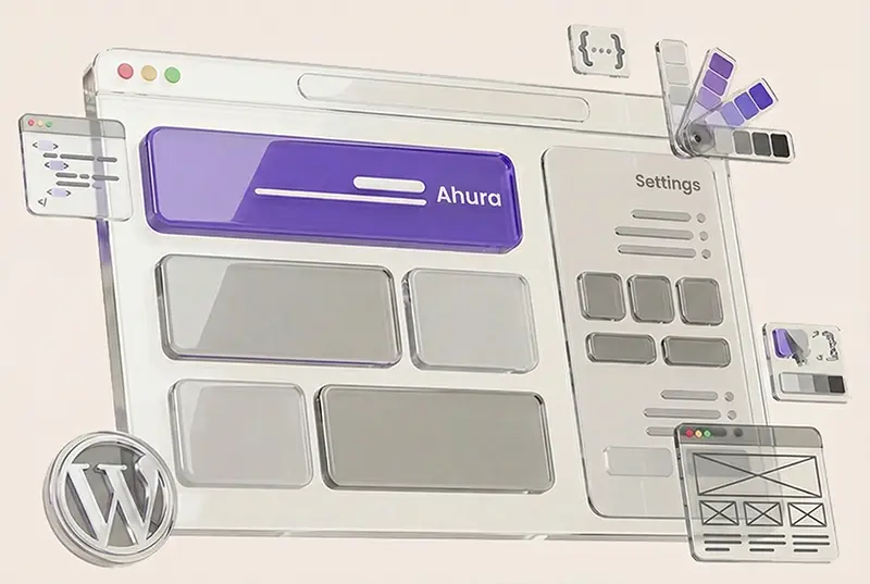


WordPress Made Simple
Welcome to Ertano. Here you’ll learn how to build your website with WordPress and grow it step by step.
Start here and launch your first WordPress website with confidence...
WordPress TV
Essential website management tips by Reza Rad


Ahura WordPress Theme
The Power to Change EverythingElementor Page Builder
The most powerful WordPress page builder with 100+ exclusive custom elements.
Incredible Performance
With Ahura’s smart modular loading technology, files load only when they are truly needed.
SEO Optimized for Google
Every line of code is carefully aligned with Google’s algorithms and best practices.

