
 Tutorials


 Ahura
Ahura Plugins

 Blog
BlogWhat Is the Mobilegeddon Algorithm and How Does It Affect SEO?

Take a look at your phone for a second. You’re probably reading this very text on your mobile right now, aren’t you? Well, your users are exactly the same. Today, mobile SEO is no longer a “nice-to-have” task—it’s a red line for your website’s survival. And this whole story started with a Google algorithm called Mobilegeddon, which many people nicknamed the “apocalypse of mobile websites.”
Let me give you a number that might shake you up: right now, more than 64% of total global web traffic comes from mobile devices. That means if your site doesn’t deliver a good experience on smartphones, you’re practically losing close to two-thirds of your audience at the door—before they even read a single word of what you have to say.
But don’t worry. In this article, we’re going to move forward step by step together—from what Mobilegeddon actually was and what eventually happened, to completely practical actions you can take today to keep both Google and your users satisfied. So, let’s get started.
Table of Contents
What Is Mobile SEO and Why Is It So Important for Google?
Mobile SEO means optimizing your website so that it works perfectly on smartphone screens and so Google can easily show it to mobile users. In simple terms: a site that loads quickly on a phone, has text that can be read without zooming, buttons that are easy to tap, and doesn’t leave users confused when they’re trying to find what they need.
So why is Google so sensitive about it? Because it has an unwritten rule: it always sides with the user, not the website. If someone enters your site and leaves within a few seconds because of slow speed or a messy layout, Google sees and records that behavior. The result? Gradually lowering your ranking and giving your spot to a competitor who has paid attention to mobile.
Interestingly, this isn’t just about mobile users. Since Google adopted a method called “Mobile-First Indexing,” it primarily looks at the mobile version of all websites for ranking—even for someone searching on a laptop. That means if your mobile version is weak, desktop users will also see you ranked below competitors. So mobile SEO is no longer a separate part of SEO; it is SEO.
What Was the Mobilegeddon Algorithm? From 2015 to Today
Let’s go back to where it all started. In April 2015, Google introduced an update designed to rank mobile-friendly websites higher in mobile search results and push others lower. Google itself didn’t give it a special name, but SEO professionals—being a bit dramatic (!)—called it “Mobilegeddon,” a combination of “Mobile” and “Armageddon,” meaning the “mobile apocalypse.”
The interesting part is that Google didn’t catch anyone off guard. About two months earlier, in February 2015, it officially announced that mobile-friendliness would become a ranking signal and gave website owners time to prepare. That’s why, in practice, the impact of this update was much smaller than its name suggested; those who were ready didn’t experience any major disruption.
But the story didn’t end there. About a year later, in May 2016, Google strengthened this signal to put more pressure on unoptimized sites. At the time, many people asked, “Does this mean Mobilegeddon 2?” But Google’s John Mueller clearly said, “No, not really.” So the next time you see the term “Mobilegeddon 2,” know that it’s an unofficial industry label, not an official Google update.
The truly big shift happened afterward: Google gradually rolled out Mobile-First Indexing and around 2021 made it the default for all websites. From that point on, mobile was no longer a “secondary version”—it became the primary version by which Google judges your site.
And today? Google’s focus has moved from “Is your site mobile-friendly?” to something broader called Page Experience, along with precise metrics for speed and stability, which we’ll cover in detail in later sections. In short: Mobilegeddon wasn’t an ending point—it was the starting point of a world where mobile comes first.
From Mobilegeddon to Mobile-First Indexing and Page Experience
Up to this point, we’ve learned that Mobilegeddon was just the beginning. But did Google sit idle over the past few years? Absolutely not. Let me walk you through the path that has been taken, because understanding this journey helps you see what Google is looking for today.
Step One: The perspective completely changed. In the early days, Google evaluated websites based on their desktop versions, and mobile was just a secondary consideration. But with mobile-first indexing, everything flipped. Now Google looks at your site’s mobile version first, reads it, and determines your rankings based on that. This means if part of your content exists only on desktop and you’ve hidden it on mobile, it’s practically as if that content doesn’t exist for Google. So everything—text, images, structured data—must be fully present on the mobile version as well.
Step Two: Google moved beyond a simple “yes/no” approach. In the beginning, Mobilegeddon delivered a black-and-white answer: your site was either mobile-friendly or it wasn’t. That model is now outdated. Today, instead of applying a simple label, Google measures a full spectrum of user experience quality. It calls this set of criteria Page Experience.
What Exactly Is Page Experience?
It’s like a comprehensive record that Google creates for each of your pages, evaluating factors such as:
- Does the page load quickly and remain stable while users interact with it? (These are the Core Web Vitals, which we’ll explore fully in the next section.)
- Is it secure with HTTPS?
- Can mobile users interact with it easily, without intrusive pop-ups blocking their view?
The key point is this: none of these factors alone works miracles. Google has repeatedly said that high-quality content always comes first. But when two pages are similar in content quality, Page Experience becomes the tie-breaker. In other words, Page Experience plays the role of the “balance breaker.”
And Now, the Reality of 2026
You may have heard somewhere that Google released a major new update called “Mobilegeddon 2.” As I mentioned before, no such official update exists—this is just a catchy name. The real story is less dramatic but far more important: Google is no longer looking for a one-time “earthquake” update to scare websites. Instead, it continuously evaluates mobile experience in the background and updates its assessment in real time.
This is good news! It means any improvement you make to your site will gradually reflect in your rankings, and you don’t have to wait for a massive update.
There’s also an important technical change you should know: in March 2024, Google retired one of its key speed metrics called FID and replaced it with a more precise metric called INP (Interaction to Next Paint), which measures a page’s responsiveness to user interactions. If you encounter FID in older articles, know that it’s no longer a ranking metric. This is exactly what we’ll explore in the next section.
The journey started with a simple “mobile-friendly” label, evolved into making mobile the primary version of a site in Google’s eyes, and has now become a continuous and precise evaluation of the entire user experience. So instead of fearing an imaginary update, let’s focus on what truly matters: speed and quality of experience.
Core Web Vitals; Real Metrics of Mobile Speed
We’ve reached the most important technical part of the article. If you’re only going to remember one thing from this entire piece, this is it. Core Web Vitals are three metrics Google uses to measure how smooth the user experience is on your page. Think of them as three traffic lights; each one checks a different aspect of the experience.
Let’s go through them one by one, very simply:
LCP — Loading Speed (Largest Contentful Paint)
This metric measures how long it takes for the largest element on your page (usually a large image or the main headline) to fully appear. From the user’s perspective: “How many seconds did it take before I felt the page had really loaded?” Ideal number: under 2.5 seconds. If it’s between 2.5 and 4 seconds, it needs improvement. Above 4 seconds means you’re in the red zone.
INP — Responsiveness (Interaction to Next Paint)
This one is new and replaced the old FID metric in March 2024. INP measures how quickly the page responds when a user clicks or taps on something (like a menu button or “Add to Cart”). Nothing is worse than clicking a button and feeling like nothing happened, right? Ideal number: under 200 milliseconds. Between 200 and 500 needs work, and above 500 means users will clearly feel the lag.
CLS — Visual Stability (Cumulative Layout Shift)
This metric measures one of the most annoying mobile experiences: you’re reading a text, and suddenly an image or ad loads, the whole page jumps down, and you accidentally click something else. CLS measures exactly this “jumping” and unexpected shifting of elements. Ideal number: under 0.1 (the closer to zero, the better).
Now, why are these so important? Because Google collects this data not from a lab test, but from the real experience of real Chrome users (this is called field data). That means you can’t trick it with a gimmick; you actually have to be fast for your users.
And here’s a reality that shows how much opportunity there is: according to 2025 statistics, only about half of the world’s mobile websites pass all three of these metrics at the same time. So if you turn all three of these lights green, you’re practically ahead of half your competitors. Not a bad deal!
don’t guess these numbers. In the next sections, I’ll show you which free tools (like PageSpeed Insights and Search Console) let you see your site’s exact numbers right now and understand precisely where you’re falling short.
How Can We Increase Website Speed on Mobile?
Alright, so far we’ve understood what numbers Google is looking for. Now let’s get to the sweet part of the story: the real actions you can take to turn those red lights green. The good news is, you don’t need to be a developer; most of these tasks can be done with a few simple settings and plugins.
Optimize Your Images (The Most Important Task!)
Let me be blunt: in 90% of websites, the biggest enemy of mobile speed is heavy images. A single multi-megabyte image can bring an entire page to its knees. Do these two things:
- First, switch your image format from old JPEG and PNG to modern formats like WebP or AVIF. With the same quality, they can sometimes reduce file size by up to 70%.
- Second, before uploading, resize the image dimensions to match where it will actually be displayed. Uploading a 4000-pixel image for a space that only shows 800 pixels is just wasting speed and bandwidth.
Use Lazy Loading
Lazy Loading means loading content “lazily.” Instead of the browser loading all page images at once, it only loads what’s currently visible to the user and postpones the rest until the user scrolls down to them. For users on slow or unstable mobile connections, this is a real blessing and directly improves LCP.
Minify CSS and JavaScript Files
Website code is full of spaces, line breaks, and characters that help humans read it but aren’t needed by browsers. Minifying means removing these extras to make files lighter. The good part is that you don’t have to do this manually; caching plugins can handle it automatically.
Install a Caching Plugin
This might give you the biggest impact with the least effort. A caching plugin creates and stores a ready-made static version of your pages so that each time a user visits, the server doesn’t have to build everything from scratch. The result? Pages load several times faster. If you’re using WordPress, try options like WP Rocket (paid but excellent) or LiteSpeed Cache (free and powerful—provided your server uses LiteSpeed).
Keep the Layout Stable to Protect CLS
Remember how annoying sudden page jumps are? To prevent this, always specify width and height for images and videos so the browser reserves their space in advance and other content doesn’t shift when they load. Also, reserve space ahead of time for ads and boxes that load later.
A Good Host Is Half the Battle
You can do all the optimizations above, but if you’re on a weak and overcrowded hosting service, your site will still be slow. A high-quality host close to your users (and using a CDN for content distribution if possible) is the foundation of all these optimizations. Don’t cut corners on this one.
Responsive Design and Mobile User Experience
So far, we’ve seriously boosted speed. But a fast website that’s hard to use on mobile will still drive users away. This is where we reach two complementary concepts: responsiveness (which adapts your site to any screen) and user experience (which makes using it enjoyable).
Responsiveness: The Foundation of Everything
Responsive design means you have one version of your website that intelligently adapts itself to any screen size—from the smallest phone to the largest monitor. Google strongly recommends this approach because maintaining a single site is much easier than managing multiple separate versions, and all your site’s SEO authority stays consolidated instead of being split.
The good news is that today, almost all professional WordPress themes are responsive by default. So if you’re using an up-to-date theme, you probably already have this covered to a good extent. But if you’re still working with an old theme, be sure to check its status—an outdated theme alone can waste all your other efforts.
Here’s a modern technical tip for those who want to go deeper: in contemporary design, instead of relying solely on rigid breakpoints, developers are gradually moving toward something called Container Queries. This feature allows each section of a page to decide how it should be displayed based on its own available space—not the overall screen width. For example, a product card might appear one way in a sidebar and another way in the main content area. You don’t necessarily need to implement this yourself, but it’s good to know that the future of responsive design is heading in this direction.
User Experience: Where You Show Kindness to the User
Being responsive means your site “doesn’t break.” But good user experience means it’s genuinely “pleasant” to use. Let’s go over a few key points:
Make Buttons and Links Large Enough
Mobile users interact with their fingers, not a precise mouse pointer. If buttons are small and too close together, users will keep tapping the wrong thing and get frustrated. Google’s standard for each touch target is at least 48 by 48 pixels, with some spacing (about 8 pixels) between elements. (If you see 44 pixels mentioned somewhere, that’s Apple’s standard; for Google, 48 is the benchmark.)
Take Thumb-Friendly Design Seriously
Most users hold their phone with one hand and navigate with their thumb. This means the top of the screen is harder to reach, while the middle and bottom areas are more comfortable. So place important elements—like the buy button, search, or contact options—where the thumb can easily reach them.
Simplify Navigation (But Not at Any Cost)
Cluttered, multi-level menus are a nightmare on mobile. The hamburger menu (the three-line icon) is a good solution for condensing navigation, but here’s an important point: don’t hide your most important links and buttons behind it. Items like search, cart, or your main sales button should remain visible and accessible at all times. Reserve the hamburger menu for secondary pages.
Keep Forms as Short and Easy as Possible
Filling out forms on mobile is difficult, so make it easier. Minimize the number of fields, use auto-fill capabilities, and trigger the correct keyboard (for example, a numeric keypad for phone number fields instead of a text keyboard). Also ensure that form fields are tall enough to be comfortably tappable.
Avoid Intrusive Pop-ups
Nothing ruins the experience like a full-screen pop-up that covers all content as soon as a user enters the site. Google also takes a strong stance against these intrusive interstitials. If you truly need a pop-up, configure it to appear after the user has scrolled a bit—and make sure it’s easy to close.
responsiveness is the bare minimum you must implement, but what truly sets you apart from competitors is attention to user experience details. Whenever you’re unsure, ask yourself one question: “If I were the user, would interacting with this section on my phone frustrate me or not?”
Practical Mobile Optimization Checklist (10 Steps)
Alright, we’ve reached the practical wrap-up. Think of this checklist as a roadmap: start from the top and tick off each task as you complete it. You don’t have to do everything overnight, but the more boxes you check, the happier both Google and your users will be.
- Check that your theme is responsive and up to date. Old themes built with outdated technologies are absolutely unsuitable for modern mobile devices. If your theme is old, the first and most important step is to replace it.
- Measure your site speed. Use Google PageSpeed Insights and GTmetrix to get your mobile score. If your mobile score is below 70, you have serious room for improvement. Write this number down so you can track your progress after optimization.
- Optimize and modernize your images. Convert them to WebP or AVIF format and resize them according to their display dimensions. Remember, heavy images are the biggest enemy of mobile speed.
- Install a caching plugin. Options like WP Rocket or LiteSpeed Cache create a static version of your pages and reduce server load. With minimal effort, this can have a major impact on speed.
- Enable lazy loading. Instead of loading all images at once, they should load only when the user scrolls to them. This makes a noticeable difference, especially for users with unstable internet connections.
- Define image and video dimensions. This allows the browser to reserve space in advance and prevents layout shifts during loading (the CLS we mentioned). It’s a small task with a big impact on user experience.
- Remove or limit intrusive pop-ups. If you truly need a pop-up, configure it to appear after the user scrolls and make sure it’s easy to close—not something that covers the entire screen immediately.
- Make your text readable. Set the main body font size to at least 16 pixels and adjust the line height between 1.4 and 1.6. This maximizes readability on small screens and eliminates the need for users to zoom in.
- Make buttons and links large and well-spaced. Each tappable element should be at least 48 by 48 pixels, with about 8 pixels of spacing from others. This prevents accidental clicks and reduces user frustration.
- Test on real devices. Don’t rely solely on browser simulators. Ask a few friends or colleagues to visit your site on different phones and honestly tell you where they experienced issues. No tool can replace feedback from a real human.
Once you’ve checked off all of these, you can be confident your site is ahead of most competitors. Now, let’s see which tools you can use to continuously monitor your performance.
Free Mobile Testing Tools in 2026
The good news is that you don’t have to spend a single cent to understand your website’s mobile performance. There are several powerful free tools that tell you exactly where you’re falling short. But before that, let me mention an important point that many people still don’t know.
First, an important warning: If you’ve read in older articles that you should use Google’s Mobile-Friendly Test tool or the Mobile Usability report in Search Console, don’t look for them anymore! Google officially retired both tools in December 2023. So if you see those names anywhere, know that the article is outdated. The good news is that better replacements are now available—and I’ll introduce them below.
PageSpeed Insights (The Most Important Tool)
This free Google tool is the star of the show. Just enter your website address and it gives you separate scores for mobile and desktop. More importantly than the score itself, it shows you the three Core Web Vitals metrics (LCP, INP, and CLS) and even provides a list of specific issues on your site along with suggestions to fix them. If you’re going to choose only one tool, make it this one.
Google Search Console (For Ongoing Monitoring)
Search Console is your window into how Google sees your site. While the old Mobile Usability report has been removed, it now includes a much more important section called Core Web Vitals. This section shows the performance of all your site’s pages (not just one) based on real user data. Here, you can identify which groups of pages have speed issues and need attention. Make sure to register your site in Search Console—it’s free and essential.
Lighthouse (Google’s Official Replacement)
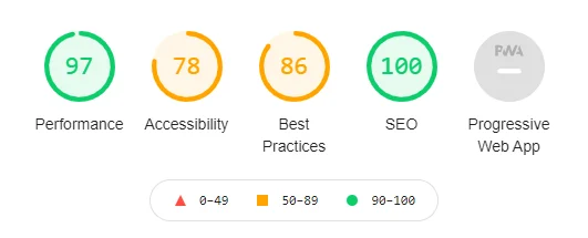
When Google retired the old tools, it officially introduced Lighthouse as their replacement. This tool goes far beyond a simple mobile test—it evaluates performance, accessibility, SEO, and more, all at once. The best part is that you don’t need to install anything. In the Chrome browser, just right-click on a page, go to Inspect, and use the Lighthouse tab to generate a full report.
GTmetrix (For Deeper Analysis)
If you want more detailed insights, GTmetrix is an excellent option. Its waterfall chart shows exactly how long each file takes to load, helping you pinpoint performance bottlenecks. It’s incredibly useful for identifying that heavy image or script that’s slowing down your site.
With just these free tools, there’s no need to guess anymore. Get your metrics, identify the issues, fix them, and test again. This cycle of “measure, fix, measure again” is the secret that separates successful websites from the rest.
Frequently Asked Questions About Mobile SEO and Mobilegeddon
Is the Mobilegeddon algorithm still active?
Yes and no. The original Mobilegeddon update in 2015 was a one-time event and no longer exists in that exact form. However, its spirit is very much alive—and even stronger. Today, mobile-friendliness is no longer a separate penalty; it has become an integral part of Google’s overall ranking system (through mobile-first indexing and page experience metrics). So in practice, it is always active.
What is “Mobilegeddon 2”? Has Google released a new update with this name?
No. There is no official update called “Mobilegeddon 2.” It’s simply an unofficial term that occasionally circulates in the SEO community. Even when Google strengthened the mobile signal in 2016, they confirmed that it was not a “second Mobilegeddon.” So if you see this name used dramatically somewhere, don’t take it too seriously.
What is the standard button size on mobile?
According to Google’s recommendation, every tappable element (button or link) should be at least 48 by 48 pixels, with about 8 pixels of spacing from adjacent elements. (The 44-pixel number you may have seen elsewhere is Apple’s standard, not Google’s.)
How can I tell if my website’s mobile speed is good?
The easiest way is to enter your website URL into Google’s free PageSpeed Insights tool. It provides your mobile score and shows the three main Core Web Vitals metrics: LCP under 2.5 seconds, INP under 200 milliseconds, and CLS under 0.1. If all three are green, you’re in good shape.
For mobile SEO, is a responsive site better or a separate mobile version?
Responsive. Google itself recommends this approach because maintaining a single website is easier, and all your SEO authority remains consolidated in one place instead of being split across multiple versions.
Does having a slow website really cause ranking drops?
Yes. Speed is one of Google’s direct ranking factors. But even more important than Google is your user. Statistics show that a high percentage of mobile users abandon pages that take more than a few seconds to load. When users leave quickly, Google sees this negative signal and lowers your ranking.
Conclusion
If I had to sum up this whole article in a single sentence, it would be this: Mobilegeddon was never a threat—it was an opportunity. An opportunity for businesses willing to think one step ahead of their competitors.
The real question today is no longer “Is my site mobile-friendly?” It’s “Does my site give users the best possible experience on mobile?” Google stopped looking for a simple checklist years ago. What it wants now is a site users are genuinely happy with—one that loads fast, reads easily, and feels good to use.
So start today. You don’t have to fix everything at once; begin with what matters most—images, speed, and a solid theme—and move forward one step at a time. Every small improvement gets noticed, both by Google and by the users who’ll stick around, trust your site, and eventually become loyal customers.
Good luck—and may your site always shine on mobile.

Ahura WordPress Theme
The Power to Change EverythingElementor Page Builder
The most powerful WordPress page builder with 100+ exclusive custom elements.
Incredible Performance
With Ahura’s smart modular loading technology, files load only when they are truly needed.
SEO Optimized for Google
Every line of code is carefully aligned with Google’s algorithms and best practices.
To post a comment, please register or log in first.