
 Tutorials


 Ahura
Ahura Plugins

 Blog
BlogHiding WordPress Widgets on Mobile with the Widget Options Plugin
- Tutorials
- Updated on

You’ve probably wrestled with widgets in WordPress before. Those dynamic blocks that usually sit beside your site (the sidebar) or at the bottom of the page (the footer) and show something — recent comments, categories, search, and that sort of thing. As long as you visit the site on a computer or laptop, everything’s nice and tidy. But the moment you drop by on your phone, you notice these same widgets suddenly pop up and make the page look cluttered and messy.
So what’s the solution? Hiding the extra widgets on the mobile version. It makes your site cleaner, speeds it up a little, and improves the user experience all at once. In this article, we’re going to show you step by step how to do this with a very simple plugin.
Table of Contents
What Is a Widget, and Why Should We Hide It on Mobile?
Let’s clear something up. In many responsive themes, the widgets that sit beside the site on desktop get pushed below the site’s main content on mobile because of the lack of space. That means the user has to scroll a lot to reach them, and in the meantime the page looks crowded.
Now imagine you have three or four widgets. Things get completely messy on mobile. So it makes more sense to keep some of these widgets on desktop only and hide them on the phone. This one simple move makes your site load lighter and keeps the user from getting confused.
First Things First: Installing the Widget Options Plugin
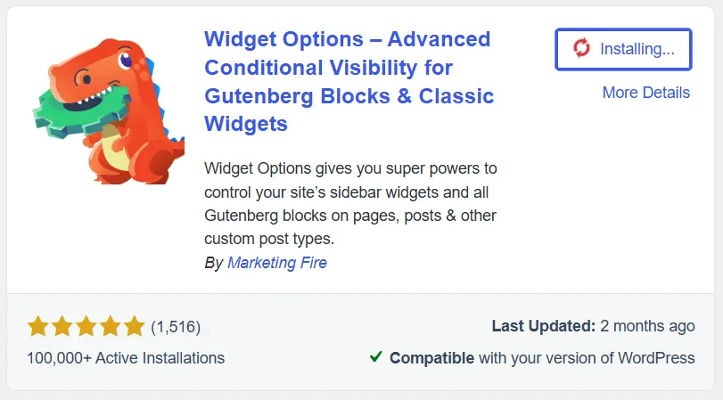
What you need to do is install the Widget Options plugin. And here’s some good news: this plugin has a free version and a premium (paid) one. But don’t worry — for what we want to do, namely hiding a widget on mobile, the free version is completely sufficient and you won’t need to spend a cent.
From your WordPress dashboard, go to the Plugins section, search for Widget Options, install it, and activate it. Done.
A Step-by-Step Guide to Hiding a Widget on Mobile
Alright, now that the plugin is installed and active, let’s get to the heart of the matter. Follow the path along with us:
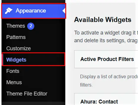
From your WordPress dashboard, go to Appearance → Widgets. A page opens called the widget management area. On the left side of that page, you’ll see the widgets currently active on your site.
Let’s proceed with an example. Suppose we want to hide the “Recent Comments” widget on mobile.
Step One: Selecting the “Hide on checked devices” option
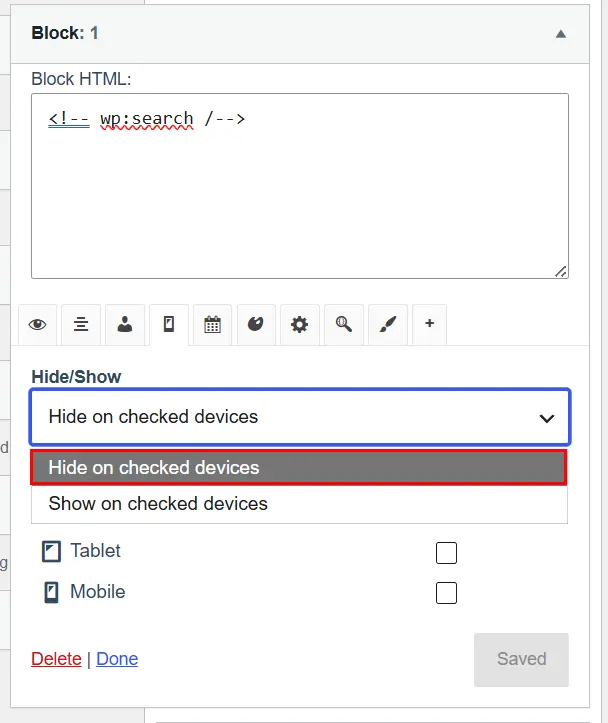
Click on the “Recent Comments” widget to open it. A small panel opens up. At the top you’ll see a few icons; select the mobile icon. Then, from the Hide/Show section, choose the Hide on checked devices option from the lower box. This option means: “On any device I check, hide this widget.”
Step Two: Selecting the Mobile device
Now, from the Devices section, check the Mobile option. By doing this you’re saying: “Hide this widget on mobile only.”
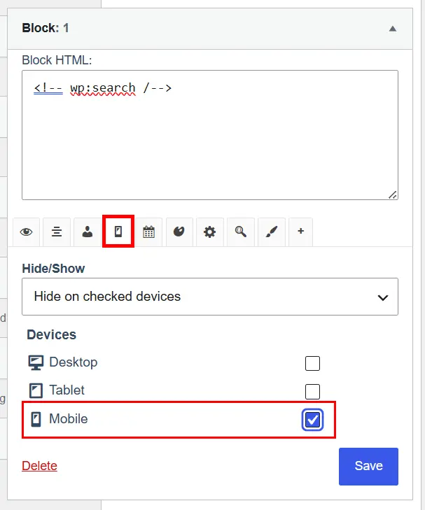
Finally, click the Save button first, and then Done. That’s it. Now go open your site on your phone and take a look. You’ll see that widget is gone. Clean and tidy.
The Number of Widgets Displayed on Different Devices
There’s another interesting scenario. Sometimes you don’t want to hide a widget entirely — you just want a different number of them to show on different devices.
For example, suppose you have six new articles and you want it to work like this:
- On desktop, all six articles show
- On mobile, only three
- On tablet, four
To do this, you need to create three separate “Text” widgets and configure each one for a device. Let’s go:
Widget one: Create a new “Text” widget, specify the number of articles you want shown on desktop (that is, six), and select the desktop device.
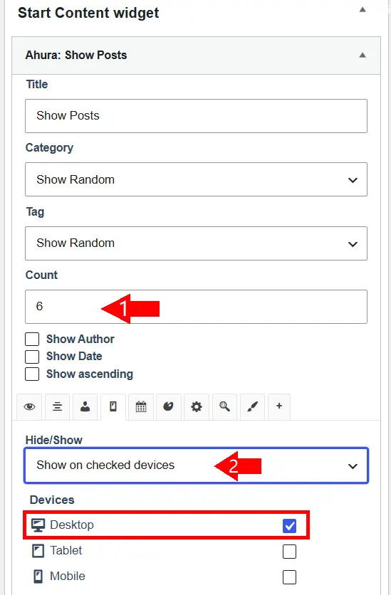
Widget two: Create another new “Text” widget, set the number to three, and this time select the mobile device.
Widget three: Create yet another new “Text” widget, set the number to four, and select the tablet device.
An important note: in all three steps, this time you need to choose the Show on checked devices option (not Hide) from the Hide/Show section. Because you’re saying, “Show it only on the device I’ve checked.” This way, each device sees only its own dedicated widget, and the rest stay hidden.
Choosing an ID and Class for Widgets
If you’re familiar with CSS and JavaScript, this plugin gives you something else too. You can assign a dedicated ID or Class to each widget and then easily style it or give it particular behavior. For someone who’s hands-on with code, it comes in very handy.
Free or Premium?
Let me give you a quick rundown of what each has so you can decide for yourself.
Free version features
- Limiting where widgets display across your site’s various pages, with just a few simple clicks
- Showing or hiding a widget on different devices (mobile, tablet, desktop) — which is exactly what we did above
- Placing custom widgets in different sections of your site
- Using a dedicated ID and Class
- Using WordPress conditional tags to determine where a widget appears
- Hiding a widget’s title from users (the title is in the dashboard for your own reference, but doesn’t show on the site)
Premium version features
- Putting a link on widget titles to send users to different sections
- Disabling widgets you don’t need at all (which also lightens up your dashboard)
- Adding special effects with CSS as the site loads or scrolls
- Increased display capability for taxonomies and terms
- Customizing the widget’s color and appearance to make it look sleeker
Wrapping Up
Well, as you saw, hiding extra widgets on mobile isn’t hard at all. With the Widget Options plugin, in just a few simple clicks and without writing even a single line of code, you can keep your site clean and tidy on every device. And the free version is completely enough for most people. So if your site has gotten cluttered on mobile, sit down, spend half an hour, and tidy it up today. Take care! 🙂

Ahura WordPress Theme
The Power to Change EverythingElementor Page Builder
The most powerful WordPress page builder with 100+ exclusive custom elements.
Incredible Performance
With Ahura’s smart modular loading technology, files load only when they are truly needed.
SEO Optimized for Google
Every line of code is carefully aligned with Google’s algorithms and best practices.
To post a comment, please register or log in first.