


Part 1: Designing the Ethereum Website Header with Elementor
- Elementor Course Tutorials
- Updated on

hey everyone! Hope you’re doing great. I know it’s been a little while, but I’m back—and this time with more energy than ever to jump back into website design using Elementor.
At Ertano, we have a dedicated section just for Elementor tutorials, where we recreate popular and well-known websites together, step by step. And now, it’s time to tackle a truly unique one: the official Ethereum website.
This site is special in so many ways. It’s clean, modern, and incredibly functional. The UI is beautifully designed, the UX is smooth and intuitive, and despite its simplicity, it’s packed with subtle details, effects, and smart layout choices. Rebuilding something like this with Elementor can be a bit challenging—but that’s exactly why we’re here.
Over the next few sessions, we’re going to recreate this website from scratch, piece by piece, using Elementor. It’ll take a bit of patience, but trust me—by the end of this series, you’ll feel far more confident and skilled as a designer. So let’s get started and dive into designing the Ethereum website with Elementor.
Table of Contents
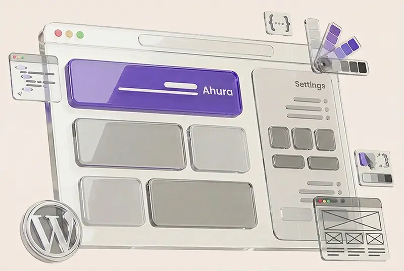
Why Are We Working on the Ahura Theme Demo?
Before we jump into the actual design process, let me explain something important. I’m not working on localhost anymore like I used to. And there’s a good reason for that.
When we design everything on a local server, sooner or later we have to spend extra time migrating the project to a live website or figuring out how to share it with you. That whole transfer process takes time and can get unnecessarily complicated. So instead of doing that, I decided to build everything directly on the demo version of the Ahura theme.
This way, we move faster, and you get easier access to the exact designs we create. Once we finish a design, we simply add it to the Ahura demo library. That means you can install the exact same layout we built with Elementor on your own website with just one click. No file transfers, no technical headaches, no manual setup. Everything is ready to go.
So instead of wasting time with migrations, we open the WordPress panel on the Ahura demo site and start designing the Ethereum website right there.
What Do We Need Before We Start?
Before entering the design space, we obviously need a few basics in place. First, WordPress must be installed on your site. That’s step one. Then we install Elementor, which is our main drag-and-drop design tool. Up to this point, everything is straightforward.
Now let’s talk about the theme we’re using. In this course, I’m building everything with the Ahura theme. Of course, you can technically use another theme if you prefer. Elementor works with most themes. But here’s the important question: how well does it work?
That’s where things get interesting. Some themes technically “support” Elementor, but when you actually start designing, you might run into limitations. Maybe certain layout controls don’t behave properly. Maybe some styling options conflict with the theme’s built-in structure. Or maybe you simply don’t get access to the flexibility you expect.
Ahura was built specifically for full compatibility with Elementor. That means the structure, templates, and layout system are designed to work seamlessly with it. You don’t have to search for hidden settings or install extra add-ons just to make basic things function properly.
That said, this isn’t meant to be a theme advertisement. The goal here is to teach website design. If you’re using another theme, that’s completely fine. Just keep in mind that you might need alternative approaches for certain sections if your theme behaves differently.
A Very Important Note About Themes and Elementor
Let me be completely honest with you: not every theme is suitable for serious design work with Elementor. You might say, “But Elementor is a plugin. It works with any theme.” Technically, yes. But the real question is how it works.
A few days ago, one of my friends ran into a really strange issue. I spent almost an hour debugging it. The theme he was using was WoodMart. What happened was this: the theme had added an extra layer on top of Elementor’s template system. So Elementor was doing its job correctly, but that additional theme layer was interfering with certain sections. Some parts of the design simply wouldn’t behave properly.
We had to go into the theme settings and define specific conditions to control those extra layers. Even after that, we ended up debugging further, writing custom PHP code, and modifying theme behavior just to make one section function correctly under certain conditions. It was exhausting. And honestly, this kind of troubleshooting isn’t for everyone. If you’re a beginner, or if you just want to focus on learning design, dealing with technical conflicts like that can completely kill your motivation.
I personally hadn’t worked with WoodMart before, but even from that short experience, I realized how messy things could get when a theme overrides Elementor’s structure in complicated ways. That’s exactly why, for this course, I chose Ahura. Everything is clean, structured, and designed to work smoothly with Elementor. No hidden layers, no unexpected overrides, no unnecessary conflicts.
When you’re following a design tutorial, your focus should be on layout, spacing, typography, structure, and user experience. You shouldn’t be stuck debugging theme conflicts or fighting technical limitations.
So if you want a smooth experience, either choose a theme you’re absolutely sure is fully compatible with Elementor, or use something like Ahura that’s built specifically for that purpose. At the end of the day, the goal here is simple: focus on learning design — not fighting bugs.
Installing and Activating Ahura Theme & Elementor
At this point, WordPress is installed. If you’re not sure how to install WordPress, make sure to check out the WordPress installation tutorial first.
Next:
- Activate the Ahura theme
- Install and activate the Elementor plugin
After installing the theme, the very first thing you should do is activate the theme license. Without activating it, many advanced features won’t be available.
You can copy your license key from your user panel and paste it into the theme’s license activation section.

After a few seconds—done! The Ahura theme is now fully activated, and all features are unlocked.

Starting the Ethereum Header Design
Now it’s time to get into the real design work.
First, I open the homepage to see the current state of the site. As you can see, it’s a clean, blank layout—nothing has been designed yet. That’s perfect.
Our goal is to recreate the Ethereum website’s appearance from scratch, including:
- Header
- Navigation menu
- Sections
- Layouts
- Visual effects
Everything will be built manually using Elementor.
Elementor is installed, the theme is active, the license is verified—everything is ready. Let’s start building this beautiful site section by section.
Creating a New Page
To begin, we need a dedicated page for designing the Ethereum header.
From the WordPress dashboard:
- Go to Pages
- Add new Page

Now, we create a new page and name it “Header”.
In the page settings, set the template to Elementor Full Width. This removes default margins and allows us to design edge-to-edge.
Click Publish, and then View Page.

You’ll still see the theme’s default header at the top—but don’t worry, we’re not using it. We’re going to design a custom header below it, specifically styled like Ethereum’s header.
Click Edit with Elementor, and now we’re ready to start designing from scratch.

Building the Header Structure
The first step is creating a new section. This section will act as the main skeleton of our header.
We ignore the theme’s default header entirely and focus only on this new section.

Before adding any elements, we analyze Ethereum’s header structure. With a quick look, we can see that it consists of:

- A logo
- A navigation menu
- A search field
- Additional items like language or login buttons
So instead of three columns, we create four columns to give ourselves more flexibility.
This structure allows us to place every element exactly where we need it.
You might notice that Ethereum also includes a light/dark mode toggle. It’s a great feature, but since it requires JavaScript, we’ll skip it for now and focus on what we can build directly with Elementor.
Creating Four Columns for the Header Layout
So far, we’ve identified three main sections in the Ethereum website header: the logo, the navigation menu, and the search bar. However, if we take a closer look, we’ll notice there’s actually a fourth area we need as well. This extra space is usually used for the login button, the light/dark mode icon (which we’ll ignore for now), or any additional item that appears in the header.
That’s why creating four columns instead of three gives us much more flexibility when building the layout.
To do this, simply right-click on one of the existing columns and choose Duplicate. This will increase the total number of columns to four.

Now we have a single row with four equal columns, each ready to hold one part of the Ethereum header—whether it’s the logo, the menu, or any other element we need to include.
Keeping Elementor Up to Date
Before adding elements, always check that you’re using the latest version of Elementor.
Newer versions (especially version 3 and above) include major UI improvements, better performance, and powerful new features. Using an outdated version can mean missing tools—or worse, things not working as expected. In this project, Elementor is fully up to date, so we’re good to go.
Adding the Ethereum Logo
We start by adding the Ethereum logo to the first column. Simply search for “Ethereum Logo SVG” on Google. The official Ethereum brand resources page provides high-quality SVG files that are perfect for web design.

SVGs are lightweight, scalable, and look sharp on all screens.
After downloading the SVG file:

- Add an Image widget to the first column
- Upload the SVG logo
Using the browser’s Inspect tool, we see that the original logo height is about 36px, so we set the image height to 35px in Elementor and center it.

To keep the layout clean, we slightly reduce the width of the logo column—around 10% works well.

Designing for RTL (Right-to-Left) Layout
When designing a website in languages such as Arabic or Persian, it’s essential to account for right-to-left (RTL) layout direction to ensure proper structure, usability, and a natural reading experience.
- The logo moves to the right
- Menus and icons are reversed
- Layout logic follows Persian reading habits
This step is crucial for creating a natural, professional experience for Persian-speaking users.
Adding the Menu to the Website Header
Now we move on to the second part of designing the Ethereum-style header: adding the navigation menu.
The original Ethereum website uses a clean and simple menu, but we want to take it a step further by using a Mega Menu, which looks more professional and gives us much more flexibility and functionality.
At the moment, the Ahura theme includes two different mega menu styles, but neither of them matches the exact header design we’re aiming for in this Ethereum project. That’s why, before starting this tutorial, I asked the Ahura design team to create a brand-new custom mega menu—so we can build something that truly fits our needs.
This new mega menu will be available in the final upcoming version of the Ahura theme.
For now, though, to keep our design process moving forward, we’ll simply add a basic menu to the header. This is only temporary, and in the next session, once the new Ahura update is released, we’ll replace it with the full professional mega menu.
Here’s an important point worth mentioning: this is exactly why I always recommend using themes like Ahura.
Yes, you can build websites with many other themes—but when it comes to advanced features like mega menus or detailed header controls, that’s where premium themes truly stand out.
Especially when there’s an active development team behind the theme, constantly releasing updates and responding quickly to real project needs.
So for now, we’ll stick with a simple menu—but don’t worry, our custom mega menu is on the way, and we’ll fully use it in the next lesson.
Adding the Search Field to the Header
So far, we’ve placed the logo and the menu inside the header. Now it’s time to move on to the third main part of Ethereum’s header design: the search section.
On the official Ethereum website, this search feature isn’t just a basic search box. It actually uses Algolia, which is a fast and professional search service that helps users quickly find content across the website and view results instantly.

Algolia also has an official plugin for WordPress, and installing it is very easy. All you need to do is go to the WordPress plugin repository, install the Algolia plugin, and activate it. However, one important point is that this plugin performs searches in English by default, and its search interface is also designed in the style of English websites.
For this reason, if you are looking for a simpler and more localized solution, you can use WordPress’s built-in tools instead — for example, Elementor’s own search widget or a basic search field. Of course, this option is more simple and does not include Algolia’s advanced features, but it works perfectly fine for websites.
In the end, the choice is yours. If you want an extremely smart and powerful search feature and you don’t mind the fact that it is mostly English-based, Algolia is an excellent option. But if your focus is on a fully Persian and simpler experience, using the default WordPress or Elementor search field is a more practical choice.
Using the Ahura Theme Search Field
In the Ahura theme, we have several different search field options that we can use when designing the header. For example, there is a simple default search field that we can easily place inside the header and start customizing right away. We have full control over editing this field, and we can change the placeholder text as well — for instance, we can set it to “Search” or anything else that matches the tone of the website.
In addition to that, Ahura also offers another search field option that looks slightly different in terms of design, and we can use that one too. It really depends on how we want to shape the user experience. For example, this search field can appear as just a simple icon, and when the user clicks on it, the search box opens. We can even decide whether the “Search” button should be displayed or not. All of these settings can be controlled directly from within the widget.

Overall, since our website design needs to look similar to the official Ethereum site, I’m going to try to style this search field as closely as possible to their layout and visual style. For example, we can also use a similar search icon to the one Ethereum uses, so the final result feels more consistent with the original design.
Converting SVG Code into a Usable File
Sometimes the icon we need isn’t available as a ready-made file and we only have access to its SVG code. The good news is that we can easily turn that code into an actual file and use it in Elementor or anywhere else.
To do this, first you need to copy the SVG code from any source you like — for example, websites such as FontAwesome or Heroicons, or even directly from a website’s HTML code. On the Ethereum website, for instance, you can simply right-click on the icon, choose Inspect, and locate the SVG code there.
Once you’ve copied the code, open a code editor such as Visual Studio Code. Then create a new file, for example named search.svg. The important thing is that the file extension must be .svg.
After that, paste the copied SVG code into the new file. Then just save it somewhere easy to find, like your desktop. That’s it — now you have a complete SVG file that you can upload and use on your website.
Finally, in Elementor or the Ahura theme, when you choose the option to add an SVG image, simply select this file and your icon will appear exactly the way you expect.
Precisely Styling the Search Field in Elementor
After placing the search icon correctly inside its column, the next step is to fine-tune the appearance of the search field so it closely matches the original Ethereum website design.
Next, we define the icon size. Based on the Ethereum website, the search icon size is set to 15 pixels, so we apply the same value to match the original design.
For the icon color, we can use the browser’s Inspect tool or a color picker to extract the exact shade from the Ethereum website. In this case, the color code was #121212. We apply this same color to both the icon and the text inside the field. Elementor supports both RGB and Hex values.
Since the background should remain white, no change is needed there. However, for the border, we can either remove it completely or set it to zero. In this design, a solid border with a thickness of 1 pixel and the same color #121212 was used to create a more consistent look.
To round the corners of the search box, we use the border radius option. On the original website, the radius value is about 0.25rem, which is roughly equal to 4 pixels, so we apply the same value to achieve a soft and modern shape.

Now we adjust the padding inside the field — especially on the right side, where the icon is placed. Adding extra right padding prevents the text from sticking too closely to the icon and makes the input field look cleaner.
Next, we can check the font size inside the field. If it looks smaller or larger than the original design, we can adjust it using the Font Size option. In this example, the default size was already appropriate, but later on, if the site font is changed to a Persian typeface, this should be unified across the design.
Finally, if the search icon still feels too small or doesn’t fit well within the space, we can increase its size from 14px to 16px for better clarity. We can also slightly adjust the width of the search field column so it feels more balanced compared to the other header elements.
By applying all these settings, the search field will look almost identical to the Ethereum website version — with the difference that it will be fully right-to-left and perfectly suited for Persian content.
Column Alignment
What you need to do is click on the main row that contains all the elements. Then, set the vertical alignment to Middle. Right away, you’ll notice that all the elements nicely align in the center of the row.

If something still looks slightly off, don’t worry — just tweak the spacing using padding and margin until everything sits perfectly in place.
Section Setup
Alright, now let’s move on to configuring the different header sections. What we want to do here is manually adjust the width of each column so that the overall header structure ends up looking similar to the Ethereum website — both in terms of sizing and layout.
First, we start by increasing or decreasing the column widths until the final arrangement looks right. For example, we might set the first column to 10%. Then we make the second column slightly smaller, maybe 8% or 10%. If both are set to 10%, that gives us a total of 20% so far.
Next, we move to another column — maybe one that holds a small element — and set that to 5%. Now the total becomes 25%, which means we still have 75% of the header width left to distribute between the remaining elements.

For the main column that contains the navigation menu, we can assign it 75%. Then we try setting the smaller side columns — like the language switcher and the search icon — to something like 10% each. But once we test it, we might realize the space feels too tight and those elements don’t have enough room.
So we adjust again, giving them a bit more space — for example, setting each one to 12%. If the layout still doesn’t feel perfectly balanced, we simply keep tweaking the numbers. Maybe we reduce the menu column from 75% down to 70%, then adjust the smaller columns to 13% and 14% until everything fits nicely.
This is really just a bit of playing around with spacing and proportions — a little trial and error, small adjustments, and shifting things around until you reach the ideal combination. That’s exactly the kind of thing you need to be comfortable with in Elementor, because it doesn’t always automatically give you the perfect layout. Sometimes you have to step in and fine-tune it manually.
At this point, we’ve built the overall header structure. The main layout is in place: the columns are defined, the icon, language selector, menu, and search field are positioned properly, and the design is already very close to what we wanted.
Now it’s time for the smaller details — the kind of finishing touches that usually come after building a header, especially when working with WordPress and Elementor.
What I did at this stage was click Publish, meaning the header is now saved and currently active on the website. But the work isn’t fully done yet, because there are still a few manual settings we need to handle — especially when it comes to menus.
Creating a New Menu
Now we go into the section where we create a new menu. I give it a name, for example: “main.” Inside this menu, I add a few simple links. Let’s say I want four items:

- Learn
- Use
- Build
- Participate
- Research
For each one, I create a placeholder link and simply use a # as the URL. This way, the items behave like links but don’t actually go anywhere yet — since we either don’t have real pages or don’t want to assign final links at this stage.
Now we have a clean, basic menu that’s purely for display purposes. After that, we can insert this menu into the Elementor header we built — maybe in the top section or above the main navigation, depending on where it’s supposed to appear.
For now, I’m not focusing too much on that upper header area, because it’s not fully complete yet, and it might not even be used in the current version of the project. Overall, this stage is mostly about menu setup and creating useful navigation lists.

One important thing to keep in mind is making sure the correct menu is selected inside Elementor. Sometimes you create a menu in WordPress, but it doesn’t show up on the site simply because Elementor hasn’t been told which menu to display.
So always double-check that the menu name you created is properly chosen in the widget settings.
Choosing the Font
Now we get to one of the most important and impactful parts of a website’s visual design: the font. A lot of people might think fonts are just a small detail, but they can completely change the overall feel of a design — especially in projects where the focus is more on UI and user experience rather than just content.
What I usually do is go into the WordPress Customizer and change the site’s font from there. In my opinion, the default font that’s currently set on the site doesn’t really match the style we’re aiming for. It feels a bit too basic, and it doesn’t fit that clean, modern look we want in this template.
The Ethereum website uses the Inter font, and this font is also available inside the Ahura theme. So I decided to choose the same one.

Of course, in the end, this is still a personal preference — you can always pick the font that best matches your own taste and project style.

Adjusting the Font Size
Let’s move on to another detail that might not stand out at first, but once you set it correctly, the entire website instantly looks cleaner and more polished: font size.
This is especially important in areas like menus and buttons. If the font size isn’t right, the text can look either too small and weak, or too large and messy. It’s one of those visual details that has a huge impact on the final design.
So what I do now is go back into Elementor editing and increase the font size slightly. Right now, the text is set to around 16px, but honestly, it feels a little too small — especially for the kind of open, modern layout we’re trying to achieve, similar to the Ethereum style.

A smaller font doesn’t really give you that spacious, modern feeling. So I increase the font size to 18px. I started with the main navigation menu and set its font size to 18. Immediately, the menu looked more readable and visually balanced.
After that, I moved on to the other header elements — like the search field and the buttons near the language switcher or logo — and adjusted them as well so everything feels consistent and unified.
For the search input, you could argue that the font size might work better slightly smaller, since it usually has limited space and shouldn’t draw too much attention. But because our goal here is a clean Ethereum-like style, I kept it at 18px too.
Design always involves a bit of trial and error — you test, adjust, and see what looks best.Once all the fonts and sizes were aligned properly, I clicked Publish to save the changes.And even though this step might seem simple, it makes a big difference in the final result.
Setting the Website Width
One very important setting that we shouldn’t overlook is the overall site width.
At first, you might think: Does the site width really matter that much?
But it absolutely does. It affects the entire layout.
If the width isn’t set correctly, everything can end up looking either too cramped and narrow, or too stretched out and messy — and you lose that professional sense of structure and alignment. So here’s what I did:
Since our goal is to build something similar to the Ethereum website, I went to their site and used the browser’s Inspect Element tool to check the width of their main layout.

I selected an element inside the main design container — like the header or a central section — so I could see its exact dimensions. When I checked it, I noticed the layout width was around 1520.8px. That means the main design area — from left to right — is built within a container of about 1520.8 pixels. I even took a screenshot so I could better understand how the logo, menu, and header elements are positioned within that width.
With that information, I went back to WordPress and opened Elementor. But instead of editing a specific section or row, I wanted to adjust the width of the entire website globally. So from the top menu, I clicked on Site Settings, which takes you into Elementor’s global layout options.

Then I went to the Layout section, where there’s an option called Site Width.

By default, this is usually set to something like 1140px or 1200px. But I changed it and set it to 1520.8px, exactly like Ethereum.

As soon as I applied that, everything fell perfectly into place:
- the logo
- the navigation menu
- the buttons
- the header spacing
All of it suddenly looked balanced and aligned, just like the Ethereum website. That cramped or scattered feeling that often happens with incorrect widths was completely gone. So this is one of those changes that might not seem obvious, but if you skip it, the entire design can feel off.
If you want a professional layout similar to high-end websites like Ethereum, setting the site width to around 1520.8px is a key step — it makes everything look clean, structured, and visually correct.
Final Adjustments
Now that we’ve set the site width to 1520.8px, something completely normal happens: some of the columns and elements that were previously sized using percentages don’t line up perfectly anymore.
Why? Because when we were building the layout earlier, the overall site width was smaller. So if we had set a column to something like 10% or 12%, that percentage was based on the old container size. Now that the site width has increased, those same percentages automatically scale up — and that can slightly throw off the layout. So what we need to do now is go back into Elementor and make a few final tweaks so everything sits nicely in place again.
Before we start editing, it’s a good idea to click Save Changes at the top first, just to make sure all the previous settings are properly stored. Then we exit the Site Settings panel and return to the normal Elementor editing view.
Once we’re back, we take another look at the header. You’ll probably notice that some elements may have shifted slightly, stretched out, or no longer feel perfectly aligned. In this project, for example, the search box at the top looked a bit off after changing the width. So what we do is select the search field and adjust its styling again.
For instance, we remove the default shadow, because shadows don’t really fit the clean and minimal design we’re going for here. We go into the Style settings, set the shadow value to zero, and make the background transparent as well.

That way, the search box loses the extra visual clutter and becomes much simpler and cleaner — perfectly matching the overall design.
Another thing we can do at this stage is fine-tune the padding (the inner spacing). If the search box looks too large or “puffed up,” we can reduce the top, bottom, left, and right padding slightly so it feels tighter and more balanced.
At this point, everything looks much better. Of course, later on we might still think of a few extra improvements or small tweaks, but overall the header is now fully designed and properly polished. Fonts, sizes, spacing, positioning, shadows, even the overall site width — everything has been brought together into a clean and consistent layout.

If you feel like something is still missing or there’s a small bug somewhere, feel free to mention it in the comments so we can review it together and make the final version even more professional.
Setting the Header as the Default Site Header
Up to this point, we’ve done all the design work inside the header: column sizing, font selection, font size, and even the global site width. But there’s still one very important step left:
How do we actually replace the theme’s default header with the custom header we built? In other words, how do we make sure this custom header shows up across every page of the website instead of the basic original theme header? To do that, we go into the WordPress Customizer from the top menu.
Inside the Header section, there’s an option called Use Custom Header. We enable it so the theme understands that we want to replace the default header.
But here’s something many people run into:
The header we designed doesn’t appear in the list at all. And the reason is actually very simple. When we first built the header, we created it as a normal WordPress page and designed it using Elementor.
But for WordPress to recognize something as an actual “header template,” it needs to be created through the proper path — not inside Pages.

In the Ahura theme, this is done through:
Ahura → Builder

That’s where you define real header and footer templates. Now that design is saved inside Elementor’s template library and can be reused.
Next, we go into Ahura Builder and create a new template.

We set the template type to Header, and give it the same name: “Header2”
Once the editor opens, we click the folder icon and insert our saved Elementor template.

A message appears asking if we want to apply the layout and design — we click Yes. Then we simply hit Publish.
Activating It on the Site
Now we return to the WordPress Customizer again. We refresh the page, go back into the Header settings, and this time when we enable Use Custom Header, the header we created finally shows up in the list. We select it, click Publish again, and that’s it.
From this moment on, our custom header is displayed across the entire website — exactly the one we carefully designed and fine-tuned step by step. Now we can open the site and see the result:

A clean, modern, professional header that matches the overall design and gives users a strong high-quality impression.
Summary
Up to this point, we’ve successfully designed and implemented the custom Ethereum-style demo header without any issues. Everything is in place and the result looks exactly the way we expected.
Next, we’ll move on to designing the mega menu and the homepage layout in the upcoming sessions. Thank you for staying with me until here. And if you’d like, feel free to leave a comment and tell me what kind of websites you’d like us to design together with Elementor in the next tutorials.
Ahura WordPress Theme
The Power to Change EverythingElementor Page Builder
The most powerful WordPress page builder with 100+ exclusive custom elements.
Incredible Performance
With Ahura’s smart modular loading technology, files load only when they are truly needed.
SEO Optimized for Google
Every line of code is carefully aligned with Google’s algorithms and best practices.
To post a comment, please register or log in first.