
 Tutorials


 Ahura
Ahura Plugins

 Blog
Blog3 Mistakes in Ecommerce Website Design + Solutions
- Tutorials
- Updated on

Most online stores make the same handful of mistakes. They look minor on the surface, but they’re exactly the kind of thing that makes a visitor land on your site, wander around for two minutes, and leave without buying anything.
Below are three of the most common offenders, along with what to do about them. Go through the list and see how many of them your own store is guilty of.
Table of Contents
A Search Form That Gets in the Way
The first mistake a lot of people make is hiding the search form behind a plain icon. The user has to click that tiny magnifying glass first, and only then can they type what they’re looking for. On mobile, this is especially painful.
Your customer should see the search box immediately and type their query right there — not go hunting for the icon that opens it. If someone came to your store looking for a specific product, search is the fastest path to a sale you have. Don’t put a door in front of it. Two other mistakes usually show up alongside a bad search form:
Autocomplete isn’t enabled
Say a customer wants to find a flash drive. The moment they type “laptop,” your site should already be suggesting matching products and categories. It gets them to what they want faster, and it makes your store feel smart and responsive rather than clunky.
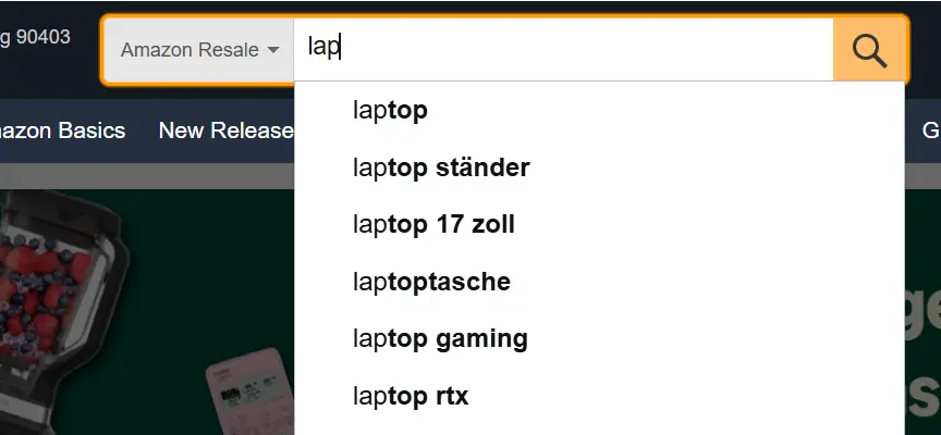
Good autocomplete also does some quiet marketing for you — it surfaces products the customer didn’t know you carried.
Typos aren’t handled
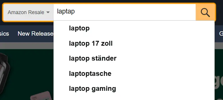
People don’t always type correctly. Someone might search for “laptap” instead of “laptop,” and your search should still return the right results instead of a dead-end “no products found” page. Every one of those empty results pages is a customer who was ready to buy and couldn’t. If you’re on WordPress, there are plenty of plugins that handle fuzzy matching and typo tolerance for you — it’s an easy win.
Not Designing Mobile First
What does mobile-first design actually mean? It means you design your site for mobile screens first, and then move on to desktop. That might sound backwards, but the mobile version matters more than the desktop one.
Why? Look at the trend over the past several years: mobile usage keeps climbing while desktop usage steadily declines. People are slowly setting their computers aside and doing everything on their phones. So having a responsive site that looks clean on a small screen isn’t a luxury feature anymore — it’s a requirement.
There’s a practical side to this too. Search engines predominantly index the mobile version of your site, which means the mobile experience is the one shaping how you rank.
A useful tip: when you’re buying or commissioning a theme for your store, check the mobile version first, and only then look at how it renders on desktop. That’s the opposite of what most people do — and it’s why so many stores end up with a desktop layout that’s been awkwardly squeezed onto a phone.
Hiding Your Categories Behind a Hamburger Menu
Plenty of online stores tuck their navigation into a “hamburger menu” — those three stacked horizontal lines. The user has to click it before the product categories even appear.
So where’s the problem? A lot of everyday shoppers have no idea what that three-line icon is or what it does. They end up spending real time and effort just figuring out where your product categories live. And a shopper who can’t find your categories can’t find your products.
The better approach is to show your categories directly in the site header — as a dropdown or a slider — so people can find what they’re after without a guessing game. Save the hamburger for narrow mobile screens where you genuinely don’t have the room, and even then, make sure something on screen signals what’s behind it.
A question that comes up a lot here: “If this is such a problem, why doesn’t Ertano follow its own advice?” The answer is simple — our audience isn’t your audience. Roughly 99% of the people who visit our site run websites themselves and know exactly what a hamburger menu is. Don’t compare a site built for web professionals to an online store built for the general public. Design for the people who actually visit you, not for the site you happen to be reading right now.
Wrapping Up
So there they are: a bad search form, ignoring mobile design, and burying your categories behind a hamburger menu. My suggestion is to go take a look at your own store right now and see which of these you’re guilty of. None of them are hard to fix, and each one quietly costs you sales every single day. Good luck out there. 🙂

Ahura WordPress Theme
The Power to Change EverythingElementor Page Builder
The most powerful WordPress page builder with 100+ exclusive custom elements.
Incredible Performance
With Ahura’s smart modular loading technology, files load only when they are truly needed.
SEO Optimized for Google
Every line of code is carefully aligned with Google’s algorithms and best practices.
To post a comment, please register or log in first.