


How to Showcase Your Web Design Portfolio the Right Way
- Tutorials
- Updated on

Hello, I hope you’re doing well. One of the most common concerns among web designers is this: I have strong projects, but I don’t really know how to present them to potential clients. In this session of our website design training series—which is meant to guide you through your journey as a web designer—I want to talk about how to present your portfolio properly and professionally.
Many designers have good work, but struggle when it comes to showing it in a way that truly reflects their skills. In this article, we’ll focus on how presentation can completely change how your work is perceived.
Table of Contents
How Can I Present My Portfolio Better?
If you’ve been working in web design for some time, you’ve probably faced this situation. You spend hours designing a website, carefully thinking through layout, structure, and details, but when it’s time to show that project to others or add it to your portfolio, it doesn’t feel as impressive as it should.
The reality is that designing a good website is only one part of the process. Presenting that design properly is a separate skill—and one that many designers underestimate. A project can be technically strong, but if it’s not presented well, it won’t leave the impact it deserves.
One common mistake among web designers, even experienced ones, is sharing their work in the simplest possible way. They finish a project and then send a plain link or upload a basic screenshot. This approach rarely creates a strong impression. Most viewers don’t have the time or patience to explore every detail on their own, so it’s your responsibility to guide them.
Just like user experience is critical in website design, the experience of viewing your portfolio matters just as much. When your work is presented well, it feels intentional, professional, and trustworthy. Even an average project can look impressive if it’s shown correctly, while a great project can easily be overlooked if it isn’t.
Methods for Presenting Website Design Projects
There are several effective ways to present website design projects across different platforms. Over the years, I’ve tested many of these methods personally, both as an individual designer and as part of a professional design team. Some techniques consistently worked better and helped clients understand the value of the work much faster.
Presenting Your Work on Your Website
One of the most common places to showcase your portfolio is your own website. If you plan to display your work online, you can use layouts and tools specifically designed for presenting projects.
Using page builders such as Elementor gives you flexibility to showcase projects through images, videos, and custom layouts. However, simply uploading a static screenshot—like many designers do—is rarely enough. A plain image doesn’t communicate the full story of the project or how the website feels in real use.
This is where presentation techniques become especially important.
Using Professional Mockups
Web design is very similar to architecture. You can build a beautiful house, but if you show it without proper lighting or interior design, people won’t fully appreciate it. Mockups play the same role for websites.
A mockup helps place your design into a realistic context. When viewers see your website displayed on a laptop, tablet, or smartphone, it becomes much easier for them to imagine how it works in real life. This makes the project feel more alive, more real, and far more professional.
Mockups are especially effective when you show different pages or devices together. For example, displaying a desktop and mobile version side by side immediately communicates that the website is responsive and thoughtfully designed. Three-dimensional mockups or mockups placed in realistic environments, such as a workspace with natural lighting, tend to create an even stronger impression.
Tools like Smartmockups or ready-made Photoshop mockup files allow you to achieve this without needing expensive hardware or photography equipment.
Choosing the Right Mockups
Not all mockups create the same impact. Some styles naturally work better for presenting website designs. Showing desktop and mobile versions together is one of the strongest options because it highlights responsiveness. Workspace-style mockups, such as a laptop on a desk, make the project feel more natural and relatable. Dark-themed mockups work especially well for modern or technology-focused designs, while three-dimensional or isometric mockups are ideal for more creative and eye-catching presentations.
What Is a Mockup?
A mockup is essentially an image of a device, such as a laptop or smartphone, where the screen can be replaced with your own design. The perspective, lighting, and depth are already built into the image, which creates a realistic three-dimensional effect once your design is placed inside it.
Finding High-Quality Mockups
One of the simplest ways to find good mockups is by searching online for website design mockups. There are many international platforms that offer both free and premium options, making it easy to find mockups that match your project’s style.

Example of Using Mockups in a Project
Imagine you’ve designed an eCommerce website. To present it professionally, you could place a screenshot of the homepage inside a laptop mockup and show a product page inside a mobile mockup. Combining these visuals into a single presentation immediately communicates design quality and responsiveness.

Platforms like Smartmockups or ready-made PSD files available on international design marketplaces make this process fast and efficient.
Important Tips When Using Mockups
When working with mockups, quality is extremely important. Low-resolution or poorly designed mockups can reduce the perceived value of your work. It’s also important to keep the presentation clean and focused so the mockup supports the design rather than distracting from it. Using different angles and paying attention to color harmony between the website and the mockup environment can significantly improve the final result.
Creating Video Presentations with Motion Graphics
Another powerful way to present website designs is through video presentations created with tools such as After Effects, Premiere Pro, or DaVinci Resolve. These videos allow you to show how the website loads, scrolls, and responds across devices, helping clients quickly understand the quality of your work without clicking through the site themselves.

Music plays an important role in these presentations. A subtle, calm track can enhance the overall experience without distracting from the visuals.
What Is a Website Video Presentation?
A website presentation video is similar to a promotional teaser. Instead of showing the website in a static and technical way, the goal is to communicate the feeling, flow, and professionalism behind the design. These videos usually begin with a simple and smooth animation, such as a device appearing on screen, followed by the website content.
Small motion graphics, like project titles or short descriptive text, add clarity and make the presentation feel more polished. Keeping the video short is essential. A duration between thirty and ninety seconds is ideal, focusing only on the strongest parts of the project.
How to Create Website Presentation Videos
Many designers start by using ready-made After Effects templates designed specifically for website presentations and device mockups. These templates already include animations, transitions, and device movements. You simply replace the placeholder content with your own screenshots.
International platforms such as Envato Elements, Motion Array, Mixkit, and Videohive offer a wide range of these templates. For more advanced work, you can create custom animations using keyframes to highlight specific details, zoom into important sections, or smoothly transition between pages.
The final result is usually an MP4 video that can be uploaded to your website, shared with clients, or used in presentations. This approach allows you to present your website designs in a highly professional way and significantly improves how your portfolio is perceived.
Creating Carousel Posts for Instagram
Instagram is an excellent platform for attracting potential clients and followers who are genuinely interested in design. You can use the same mockups and After Effects presentations you created earlier and adapt them directly for Instagram content.

Instagram Carousel Posts
One of the most effective content formats on Instagram is the carousel post. Instead of sharing a single image, carousel posts allow you to display multiple visuals in sequence, giving users the ability to swipe through your content.
This format is especially powerful for showcasing website design projects. By presenting your work as a series of slides, you allow the viewer to experience the design step by step. It’s almost like telling a short visual story. As users swipe through the slides, they spend more time engaging with your content, which increases reach and visibility on Instagram as well.
How to Create Carousel Posts for Website Design
A better approach for Instagram is to display the website you designed in a slide-by-slide format. Carousel posts are perfect for showing the design process or different parts of a website in a structured way.
Instead of posting a single static image, you create multiple slides that the user can swipe through. Each slide reveals a new part of the design, guiding the viewer through the website gradually. This creates a narrative flow and makes the experience more engaging and memorable.
How to Use Your Mockups in Instagram Carousel Posts
To create a strong carousel post, the most important thing is having a clear storyline across the slides. Each slide should connect naturally to the next and contribute to a short visual narrative.
For example, the first slide should immediately grab attention. You can use an eye-catching mockup of the website displayed on a laptop in a well-designed workspace. Adding a short, inviting headline directly on the image can increase curiosity, something like asking a question or highlighting a benefit.
The next slides can focus on different sections of the website. You might show parts of the homepage, a product listing, or a specific category, paired with short and simple text that explains the idea behind the design or its main advantages.
At some point, you can introduce the mobile version of the website by showing the design inside a smartphone mockup. This is a great opportunity to emphasize that the website is fully responsive and optimized for mobile devices.
Toward the final slide, you can include a clear call to action. This could invite viewers to get in touch, send a message, or start a conversation about their own project.
By doing this, you’re essentially combining the mockup and video presentation techniques you already use, but adapting them specifically for Instagram. Each slide becomes a separate scene: one showing the website on a laptop, another on a mobile phone, another on a tablet. It’s the same mockup-based presentation idea, just broken into individual Instagram slides.
You can also incorporate video into carousel posts. For example, you might create a very short video clip—around ten to fifteen seconds—and place it as the final slide. Alternatively, you can turn the entire story into a vertical or portrait-style video with dimensions like 1080×1350 or 1080×1920. In that video, you can show smooth transitions between pages, scrolling animations, and subtle motion effects that bring the website to life.
A Creative Idea for Instagram Carousel Posts
One particularly effective idea is arranging the slides so that when the user rotates their phone horizontally, swiping through the carousel feels like navigating through the website itself.
From a hiring perspective, especially when looking for a UI or UX designer, this kind of presentation stands out immediately. It shows attention to detail and a deep understanding of user experience, even outside the website itself.
In this approach, each slide represents a step in the user journey. The first slide shows the homepage. The next slide shows a scrolled-down version of the same page. The following slide moves into the product section. Another slide shows a product being selected and added to the cart. As the user swipes, it feels like a short interactive tour of the website.
This technique creates the illusion that the viewer is actually navigating the site, not just looking at images.
Overall, mockups provide visually striking images that help content perform well and attract attention. Video presentations add motion and a sense of liveliness to your portfolio. Carousel posts introduce storytelling and keep users engaged longer on your page. When these three elements are combined properly on Instagram, the results can be surprisingly powerful.
Before and After Comparisons
Before and after comparisons are one of the most effective and visually compelling ways to show transformation and progress. When used correctly, this technique has a strong impact on viewers and helps them clearly understand how much value your design work adds.
If you’ve worked on a project where the old version of the website is available, you should absolutely use it. Placing the old design next to your new one is one of the fastest ways to make people say, “Wow, that’s a huge improvement.”
How to Use Before and After Comparisons in Website Design Presentation
When presenting a new website or redesign to a client, showing a before and after comparison is one of the best ways to highlight improvements and changes. This technique works equally well on Instagram posts, in presentations, in your online portfolio, and even on your own website.
Seeing the difference side by side helps clients immediately understand what was wrong with the previous design and how the new version solves those problems. It makes the value of your work much more tangible.
Why This Method Is So Effective
When changes are shown clearly and visually, users can quickly grasp the improvements. They can see how the new design offers a better user experience, improved structure, or faster loading speed. This clarity helps clients appreciate the impact of your work and understand why the redesign matters.
More importantly, when improvements feel real and visible, clients feel reassured about their decision to work with you. They feel closer to the outcome they wanted and more confident in the results.
How to Apply This Technique in Website Design
One of the simplest and most popular ways to use the before and after method is through images. You show one image of the old version of the website—this could be a screenshot from the client’s previous site—and another image of the redesigned version you created.
These images can show the full page or focus on specific sections, such as the homepage, product listings, or eCommerce pages. The contrast is usually clear. The old design might look outdated, cluttered, or hard to read, with poor color choices or typography. The new design, on the other hand, appears clean, modern, visually balanced, user-friendly, and faster.
These comparisons can be used across Instagram posts, presentation slides, portfolio pages, or directly on your website to clearly communicate the value of your design work.
Using Animation and Motion Graphics
A more creative way to showcase changes is by using animation or motion graphics. Instead of relying on static images, you can create an animation that visually shows how an old website transforms into a new one. For example, you might start with a dark screen that gradually becomes brighter, revealing new details, layouts, and design elements step by step. This approach creates a more engaging visual experience and clearly communicates a sense of movement, progress, and improvement to the viewer.
By using animation, you’re not just showing the result—you’re telling the story of transformation. This makes the experience more immersive and emotionally engaging, especially for audiences who respond better to visual storytelling.
Using This Technique in Instagram Posts
On Instagram, you can apply this idea through carousel posts where one slide shows the old version of the website and the next slide shows the new design. As users swipe between slides, they can clearly see the difference and understand the transformation.
You can also enhance this effect by adding subtle motion graphics or animation. For example, the old design could gently fade out while the new design fades in. These small transitions make the comparison feel smoother and more dynamic, and they help the content stand out in a crowded feed.
Simple but Useful Explanations
Images alone are not enough. Alongside your visuals, you should include a short, friendly explanation that describes what the project was about, what the goal was, and what problem you solved. This text doesn’t need to be overly technical. Instead, it should focus on the experience and the intention behind the design, written in a way that even non-designers can easily understand.
Simple and useful explanations are one of the key techniques for building effective communication with your audience, especially when you’re trying to explain complex topics such as website features, technical improvements, or design decisions. When you break down complex ideas into clear and understandable language, people are more likely to stay engaged and take action, whether that means contacting you, signing up, or purchasing a service.
Why Simple and Clear Explanations Matter
Most audiences don’t have much time to dive into details, and their attention can shift quickly. When information is presented in a simple and concise way, people are more likely to keep reading and follow your content.
Clear language removes confusion. When your message is easy to understand, users can quickly decide whether your service or solution fits their needs. This clarity also builds trust. When people feel that you’re explaining things honestly and transparently, they’re more likely to see you as reliable and professional.
This approach is especially important in fields like web design, where services can seem technical or overwhelming. Using simple language allows people with different levels of knowledge and experience to connect with your content—not just experts.
Creating a PDF or Case Study
If you want to present your work in a more professional way, you can create a PDF or case study for each project. This document can explain the design process in detail, including decision-making, typography, color choices, layout structure, and overall strategy.
This type of presentation is extremely useful for meetings, proposals, or when sending your portfolio to companies. It clearly shows that you take your work seriously and that your designs are based on thoughtful decisions, not just visuals.
Creating a PDF or case study is one of the best ways to showcase successful projects and highlight your experience. It not only presents your work in a structured and professional format, but also strengthens your personal or brand credibility. These documents often serve as proof of your skills and real-world results.
How to Create an Effective Case Study
To create a strong case study, you need to carefully review each stage of the project and explain the process clearly.
Choosing an Engaging Title
The title should summarize the project and attract attention. It should clearly communicate what the project was about and why it matters. For example, it might highlight the type of website, the brand, or the main goal of the redesign.
Writing a Short Introduction
In this section, briefly explain what the project was and why it was created. Describe the problem that existed and the reason behind starting the project. This part should help the reader quickly understand the project’s purpose and main challenges.
For example, you might explain that a brand struggled with online sales and needed a user-friendly eCommerce website to improve performance and reach more customers.
Challenges and Problems
This section should focus on the challenges you faced during the project. These might include technical limitations, time constraints, or specific client requirements. Explain how you identified these issues and how you approached solving them.
For example, one challenge could have been designing an online store that looked modern while also maintaining fast loading speeds and working smoothly across different devices. This part shows how you handle real-world problems and make thoughtful decisions under pressure.
Solutions and Approach
Here, explain how you responded to the challenges and what solutions you implemented. You can mention the tools, techniques, or methods you used, such as responsive design principles, performance optimization, or SEO best practices.
For instance, you might describe how image optimization and content delivery networks were used to improve loading speed, while the layout was designed to enhance the experience on mobile and tablet devices.
Results and Outcomes
This section is especially important for clients. Clear, measurable results help prove the effectiveness of your solutions. You can highlight improvements such as increased sales, higher engagement, better performance metrics, or growth in traffic.
Including numbers and percentages can make a big difference. For example, you might explain how a redesigned online store led to a noticeable increase in monthly sales or a higher return rate from visitors.
Visual Evidence and Assets
Before-and-after images, screenshots, page highlights, or even comparison charts provide strong visual proof of your work. These visuals clearly show how the design evolved and how changes led to better results. If you have a video demonstrating how the new website works, this is a great place to include it as well.
Summary and Key Takeaways
In this final section of the case study, review the main points and summarize the most important achievements of the project. This helps potential clients quickly understand how you approach complex problems and what kind of results they can expect from working with you.
A strong summary reinforces the value of user-centered design and shows how attention to detail can directly impact business outcomes.
Final Thoughts
Just as creativity and attention to detail are essential when designing a website that stands out from competitors, the same level of care—if not more—is required when presenting your portfolio. How you showcase your work plays a major role in how professional and trustworthy you appear as a designer.
If you want to grow as a professional web designer, investing time in both your skills and your presentation is essential. I hope this article was helpful for you, and I wish you success in your journey. Good Lock! 🙂
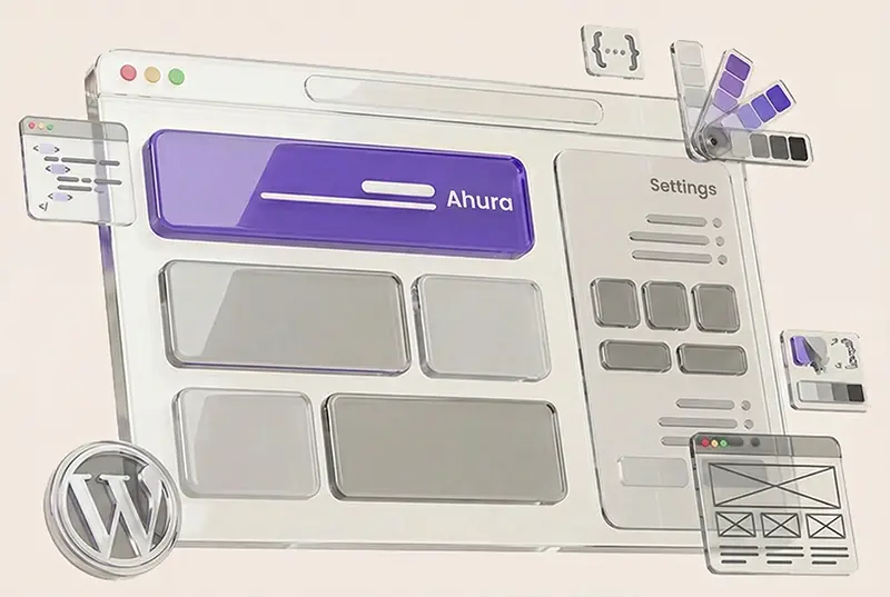
Ahura WordPress Theme
The Power to Change EverythingElementor Page Builder
The most powerful WordPress page builder with 100+ exclusive custom elements.
Incredible Performance
With Ahura’s smart modular loading technology, files load only when they are truly needed.
SEO Optimized for Google
Every line of code is carefully aligned with Google’s algorithms and best practices.
To post a comment, please register or log in first.